Design Background
Category landing page is important page for each categories to trigger customer to explore all product and promo in every category, but current UI design is not compact and clean enough, the time tab is not enough satisfactory, not consistent and not in line for all category. So this module need to be designed a new UI to promote customer’s deal.
Issue to Solve
1. New UI design for category landing pages, which need to be more compact and clean.
2. Better time tab for channel category landing page
Objective
1. Channel and icon category research
2. Design guideline
Chanel and Icon Category Research
1. What different in channel construction between JD.ID and other competitor
A different between JD.id and other competitor is because a jd.id have more category, chanel, and program. To much structure and program make a new user takes time to choose. So many scroll too. Sometime to many option its good but make a user confused. And I think prove with traffic every chanel not to much. But JD.id better than bukalapak. Bukalapak structure chanel is disordered?
2. What kind icon good to show to user and how about the design if don’t want use more space or height?
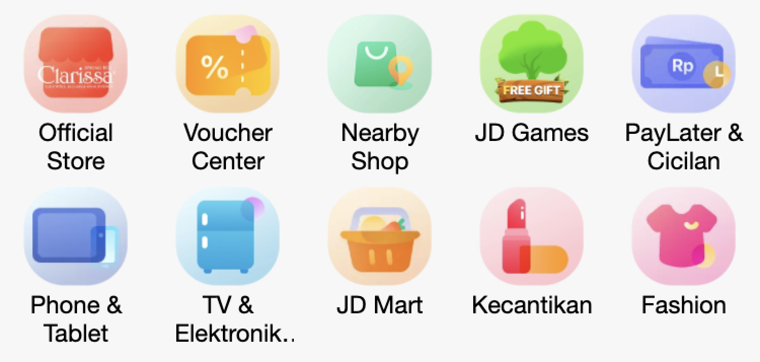
- JD.ID Category
about the category jd.id so colorfull and so many color the icon of category not uniform.
- Bukalapak Category
the category color seem like similar and uniform. Category with background color and white icon is a up to date design. But to many part section for icon category why don’t these 2 parts are not combined.
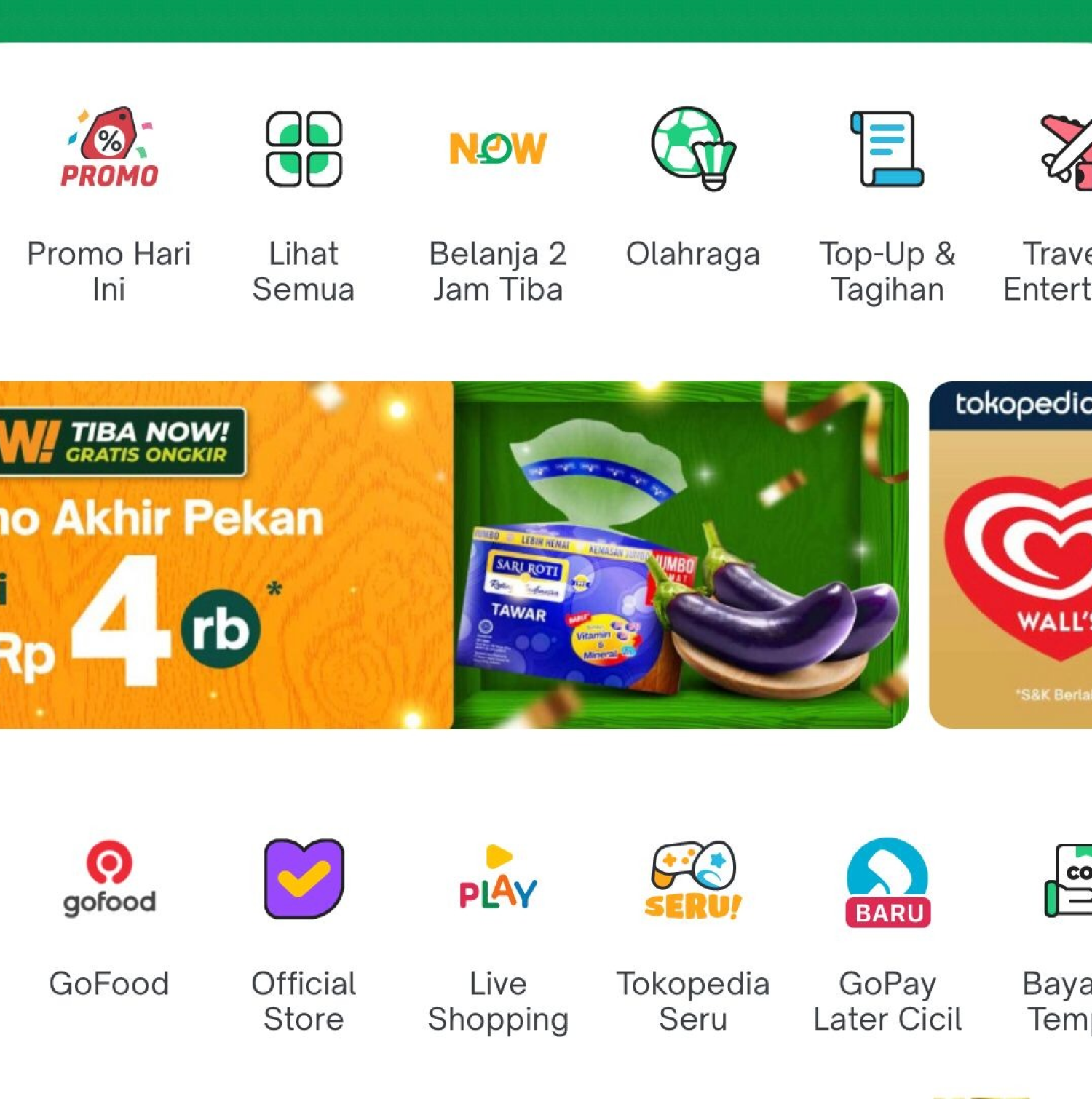
- Tokopedia Category
Icon category with slider I think its good but its complicated because the first five icon have a background but next don’t have. Its not consistent. And slider don’t show all the category and sometimes user don’t notice. About the height don’t takes up a lot of space but the slider I don’t agree with that.
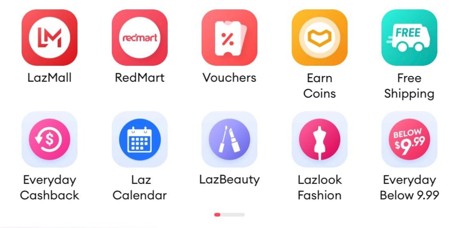
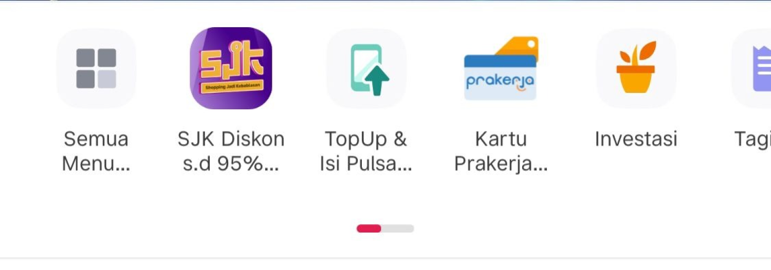
- Lazada Category
The new icon category for lazada don’t eye catching and don’t make a user notice for every category unique because the same color and little bit invicible, for the height section icon its enough.
3. What relationship between icon channel and floor channel in home?
About structure the chanel in homepage I don’t really see a exactly relation between icon category and chanel. In every chanel have a recommended option for category. In every chanel have promotion on category icon. But just one have a really same because in icon category have shortcut icon “global collection or JD Global”. Similar like other competitor have a icon don’t really have a relation. But have indirect relate and have shortcut for other important chanel in icon category
Chanel and Icon Category Research
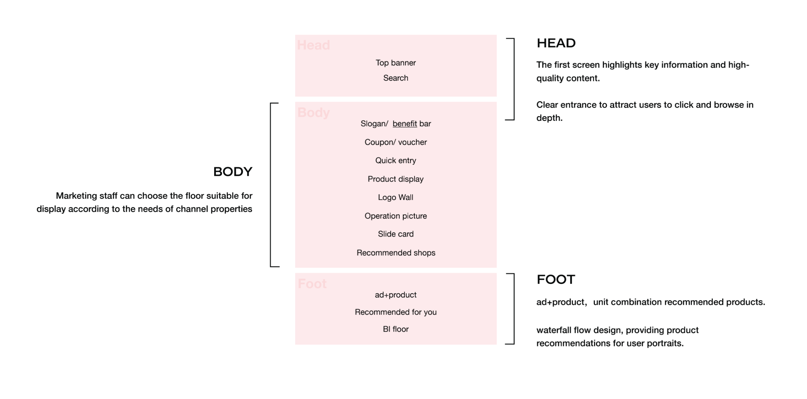
Design principles of channel homepage
The overall page is composed of several floors corresponding to different babel moduls. Custom template design are encouraged, the design of the modules should follow the following principles :
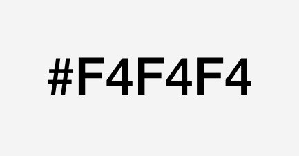
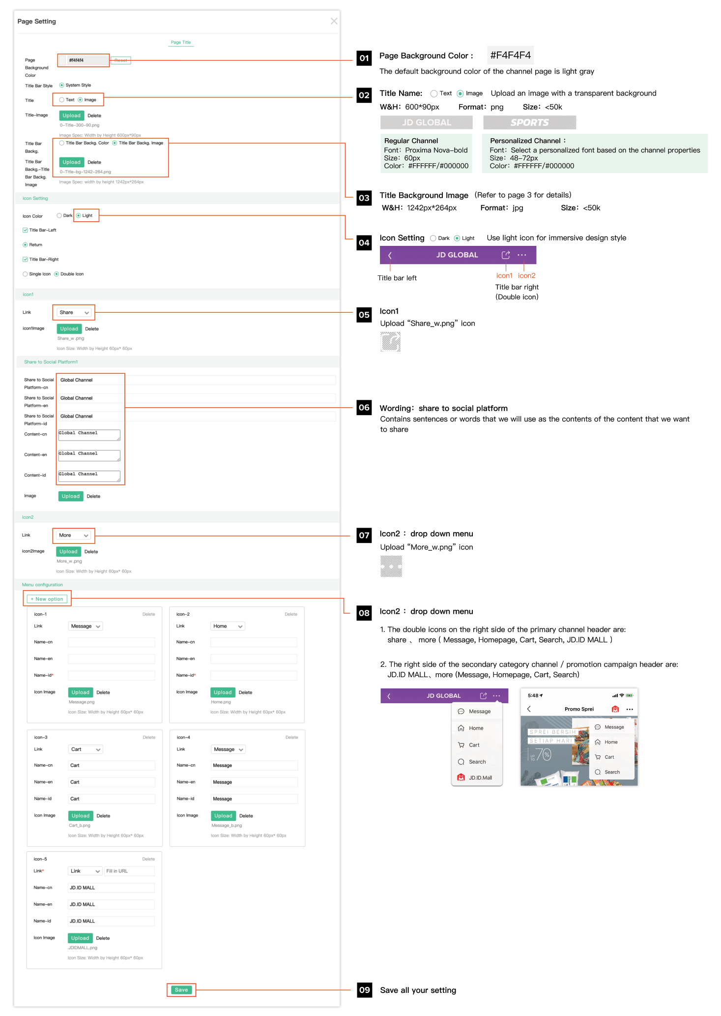
1. Uniform page background color
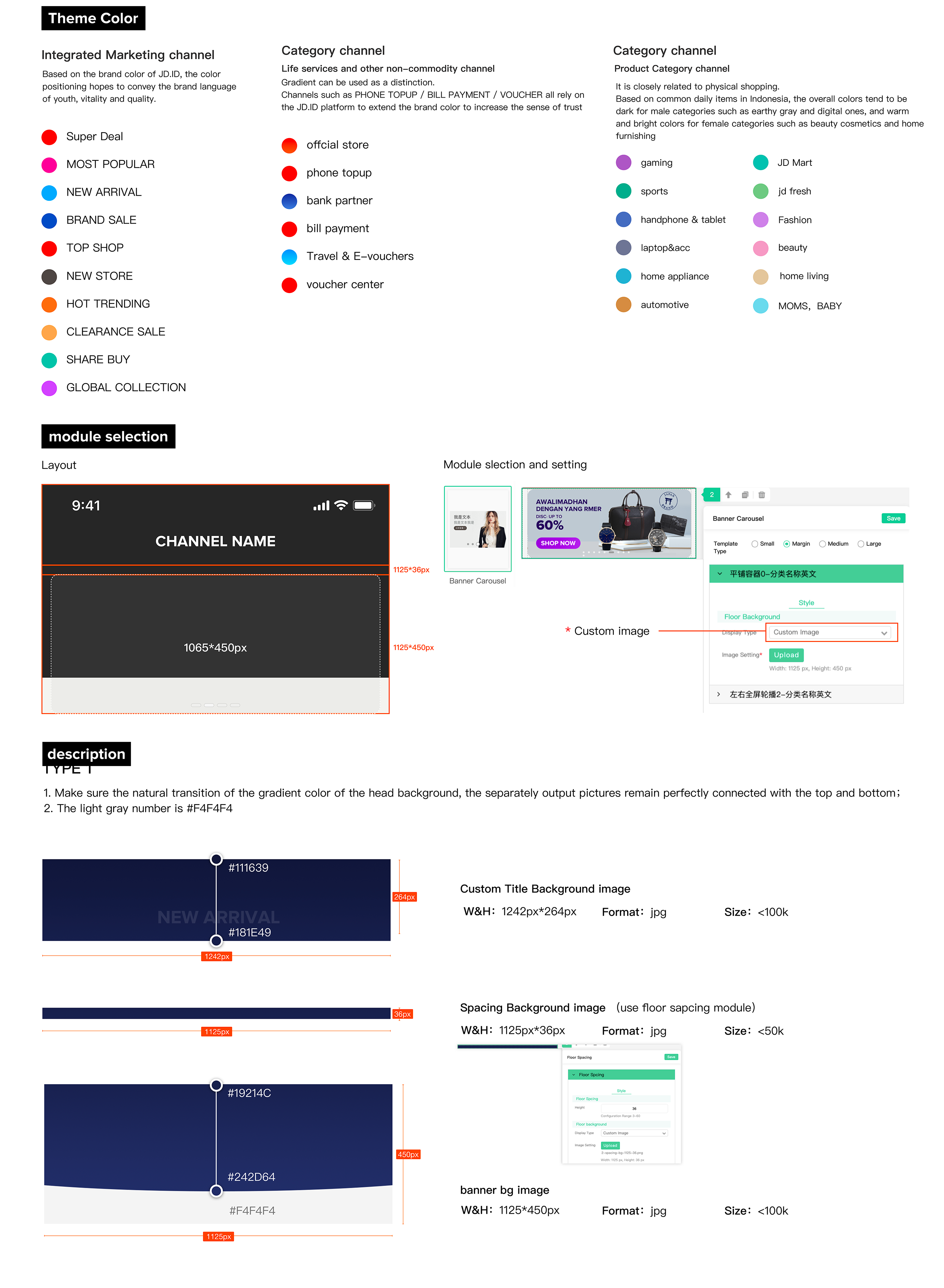
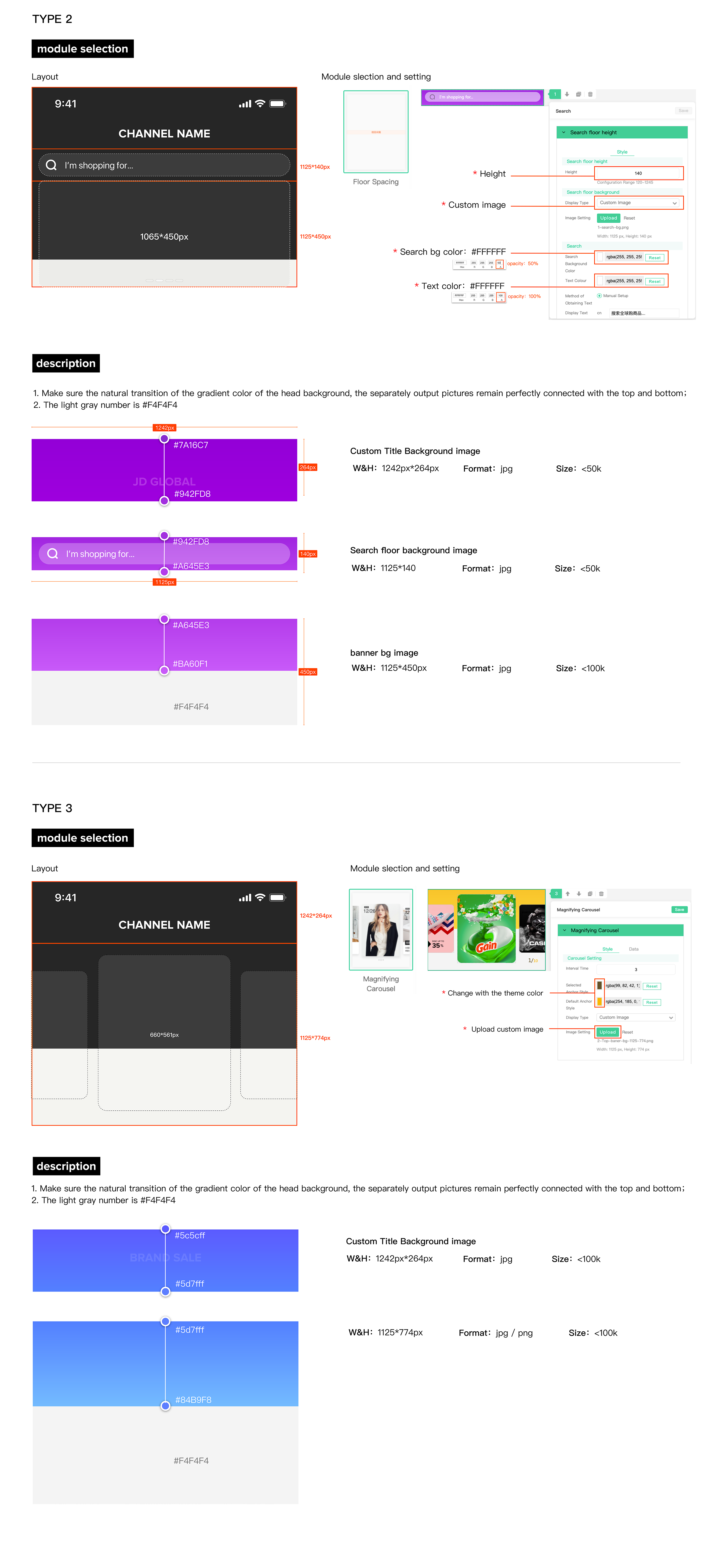
2. An immersive head design
Select a solid or light gradient color as the channel theme color (Refer to page 3 for details)

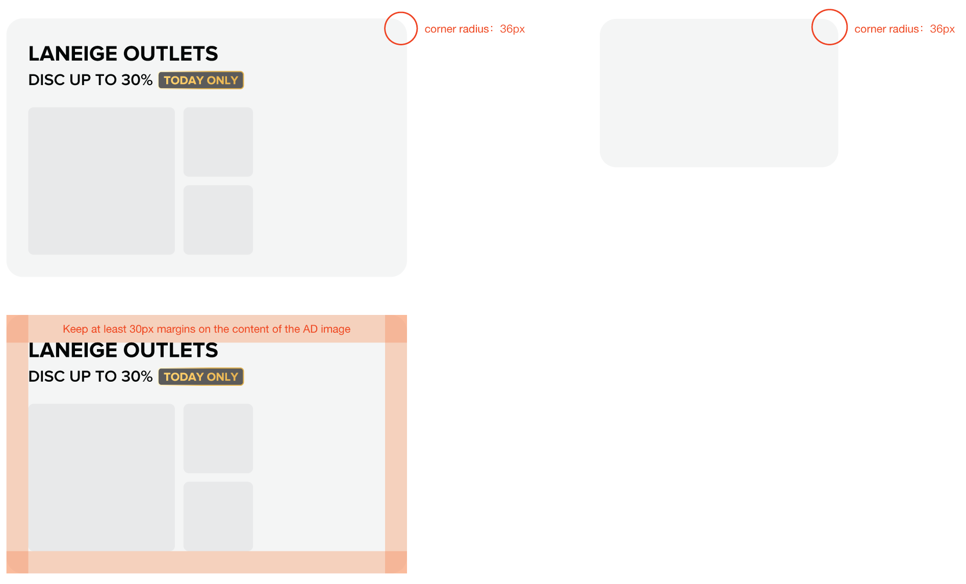
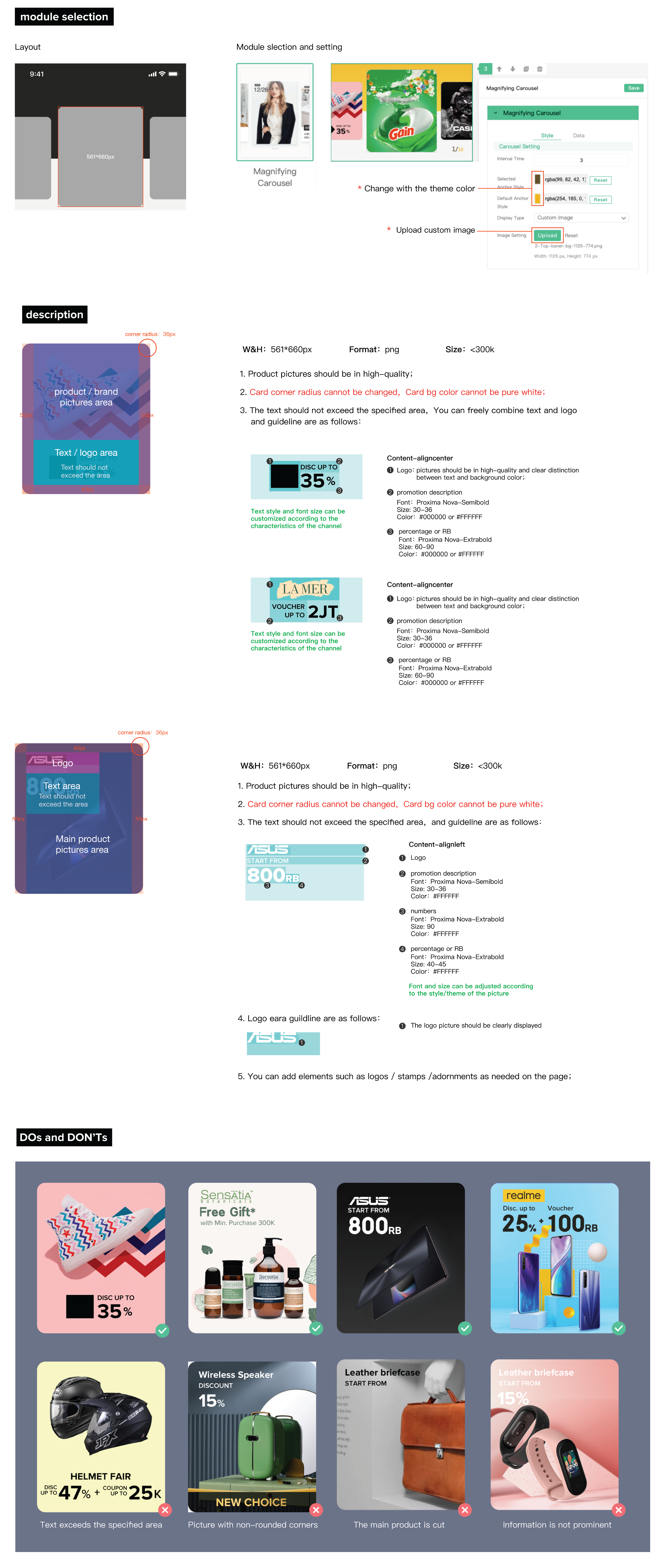
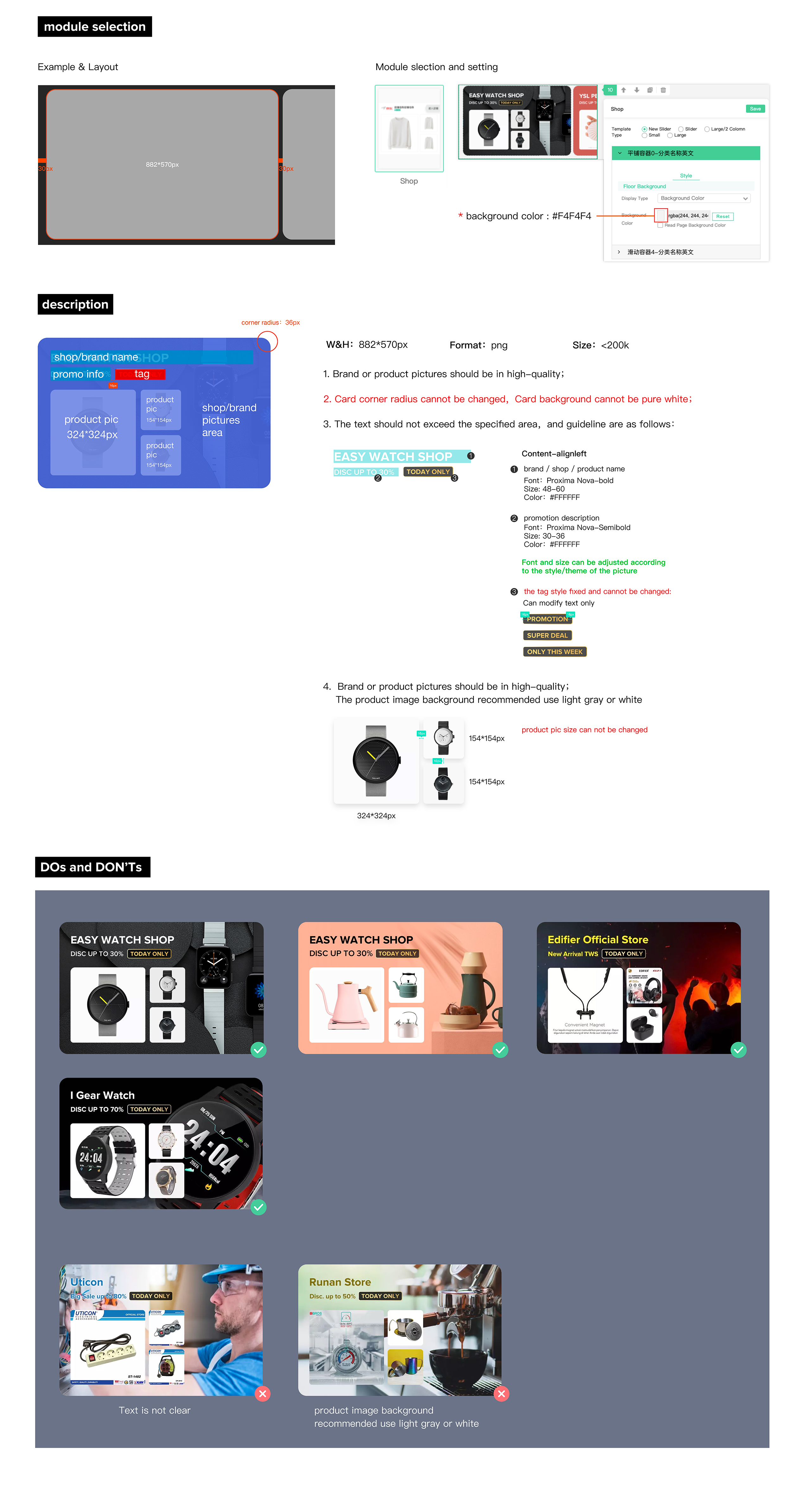
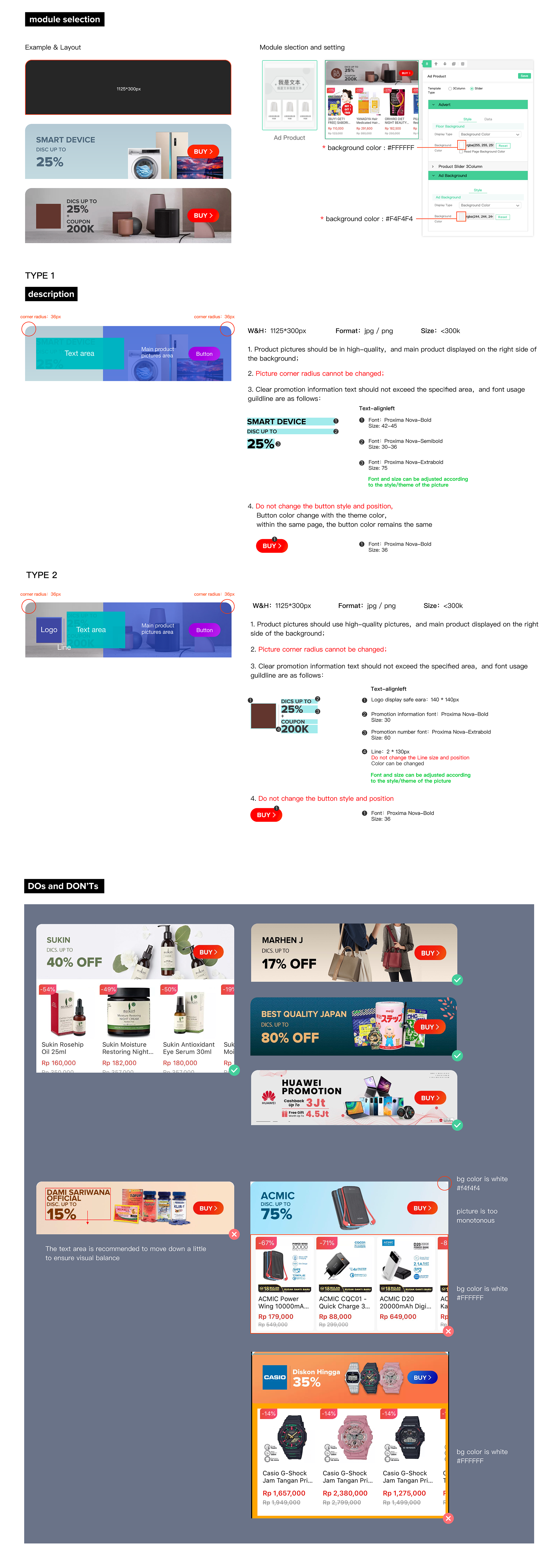
3. Card design ad.picture with a uniform rounded radius of 26px
4. Uniform basic layout
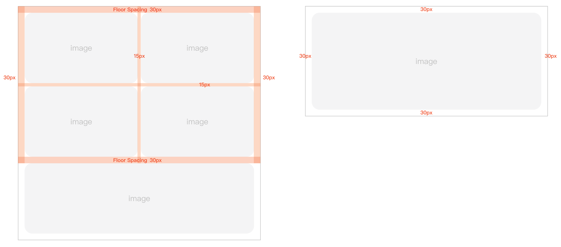
1. The content and floor margin should be 30px, The spacing between the contents is 15px
2. Keep each floor 30px apart
5. Font type and font size
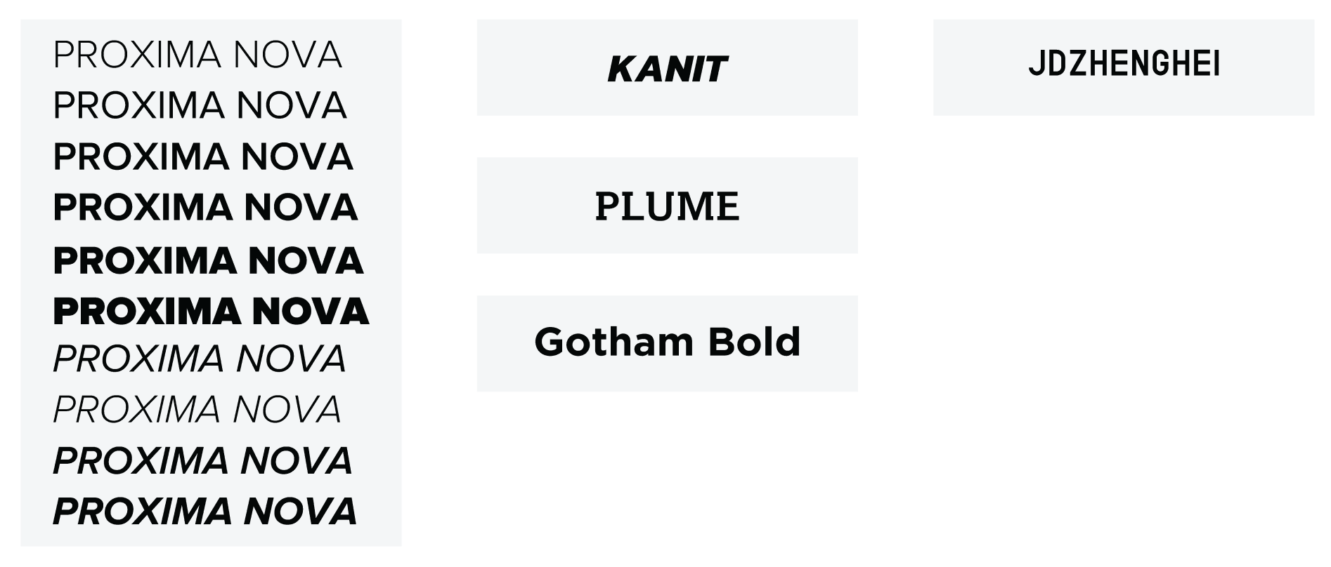
1. Try not to use more than 3 fonts on the front page of the channel
2. Regular channels use the font Proxima Nova
3. Personalized fonts can be used according to channel attributes to keep the visual experience as consistent as possible
4. Please dont use more than 5 font sizes in a single channel
6. Page Setting
Do's and Dont's

7. Top Banner
Type 1
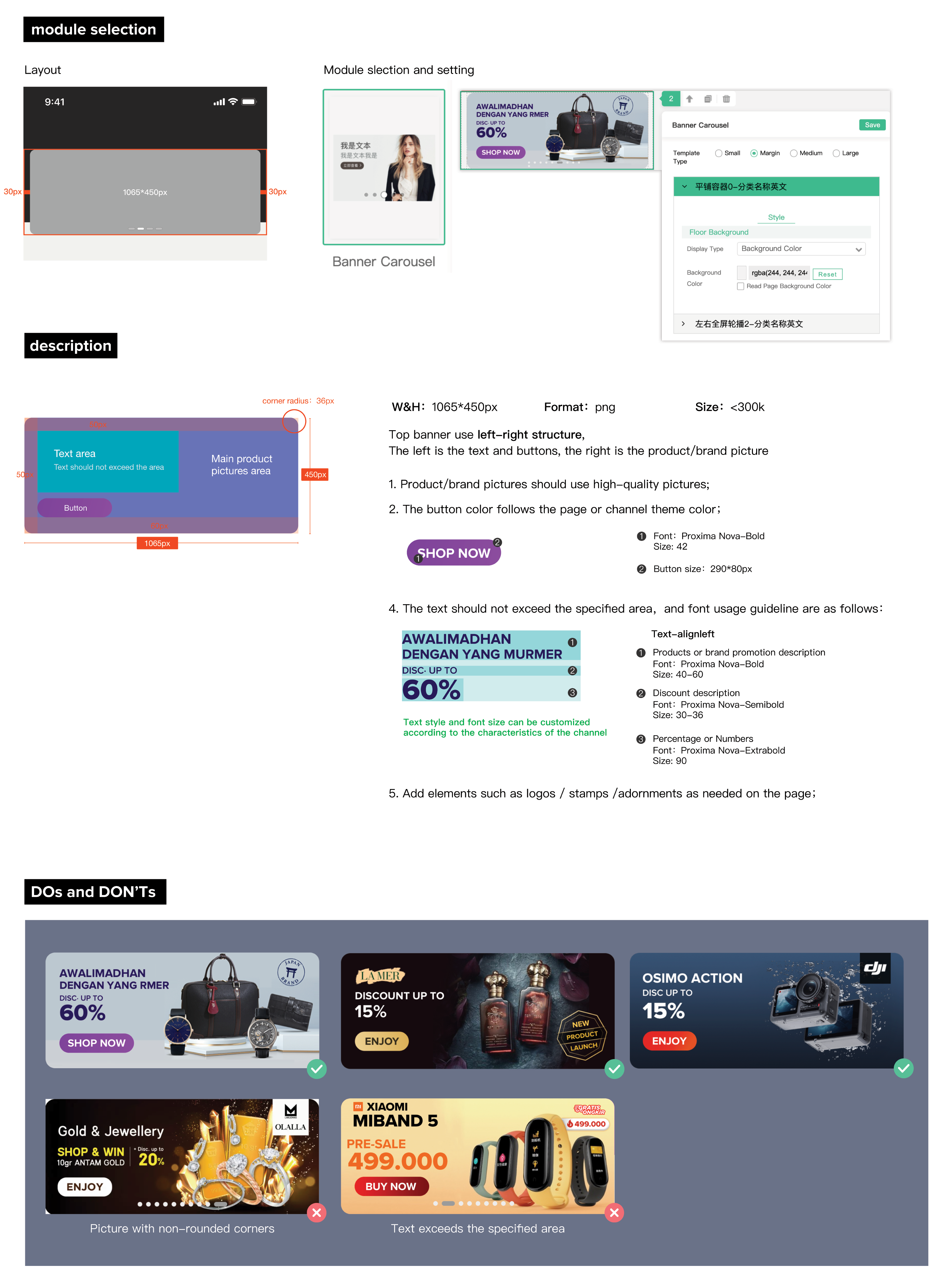
Type 2
8. Top Banner Background
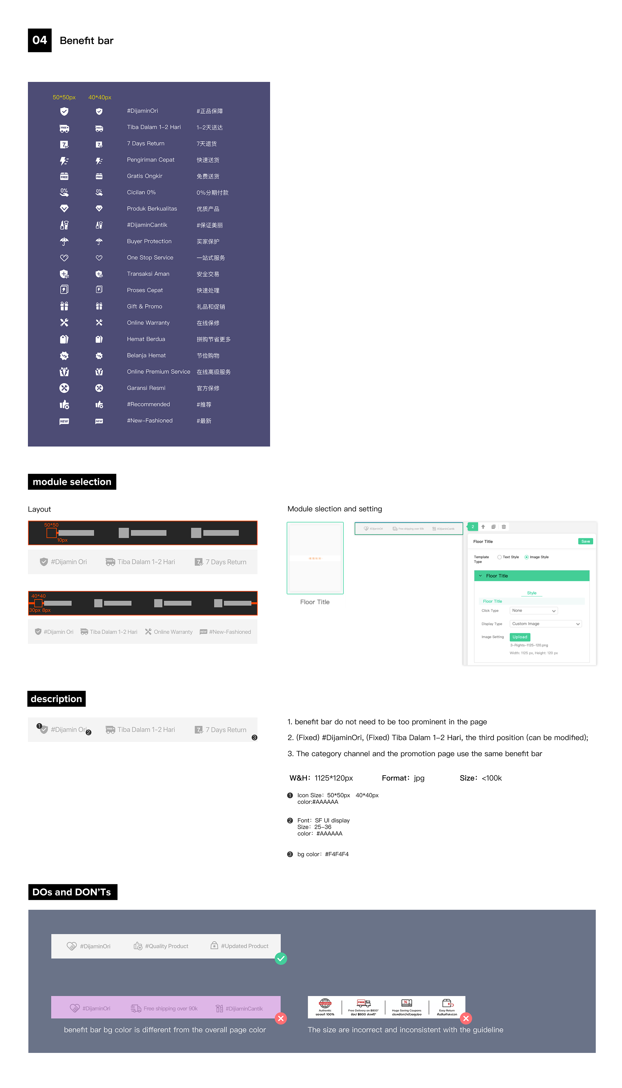
9. Benefit Bar
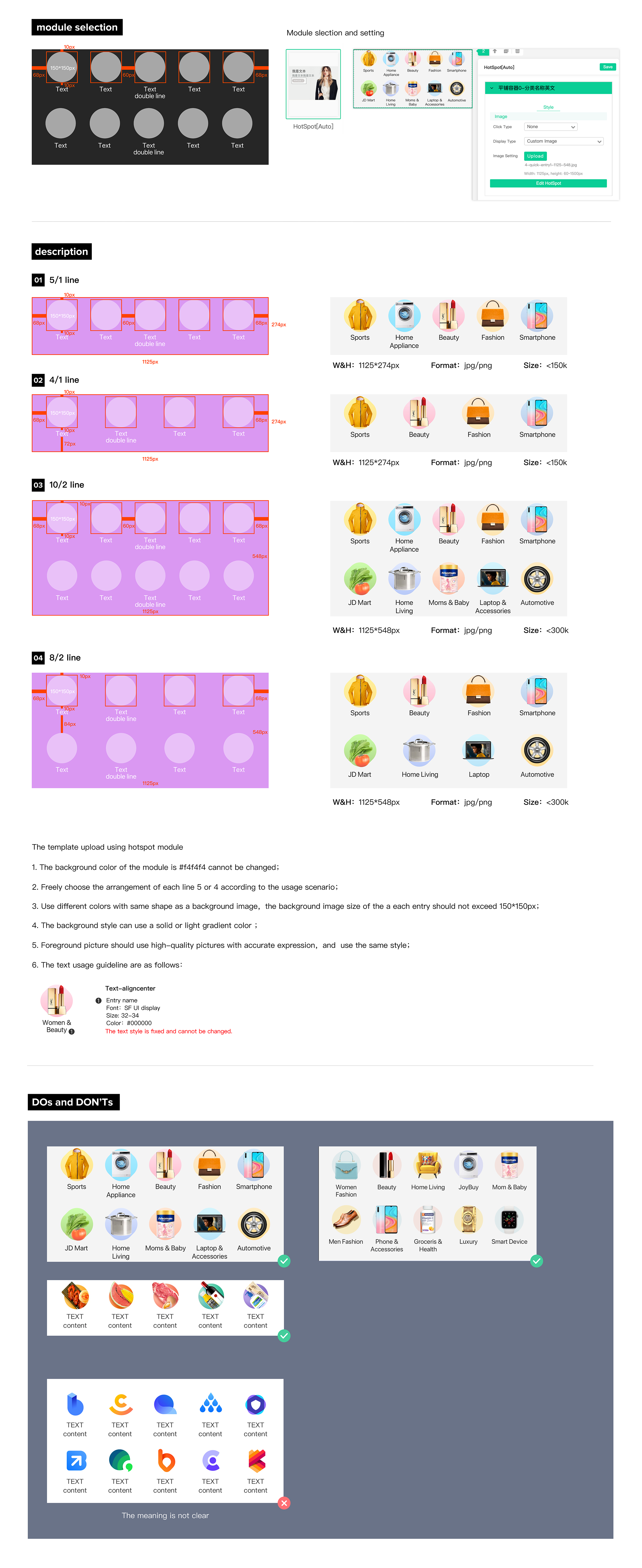
10. Quick Entry
11. Logo Wall

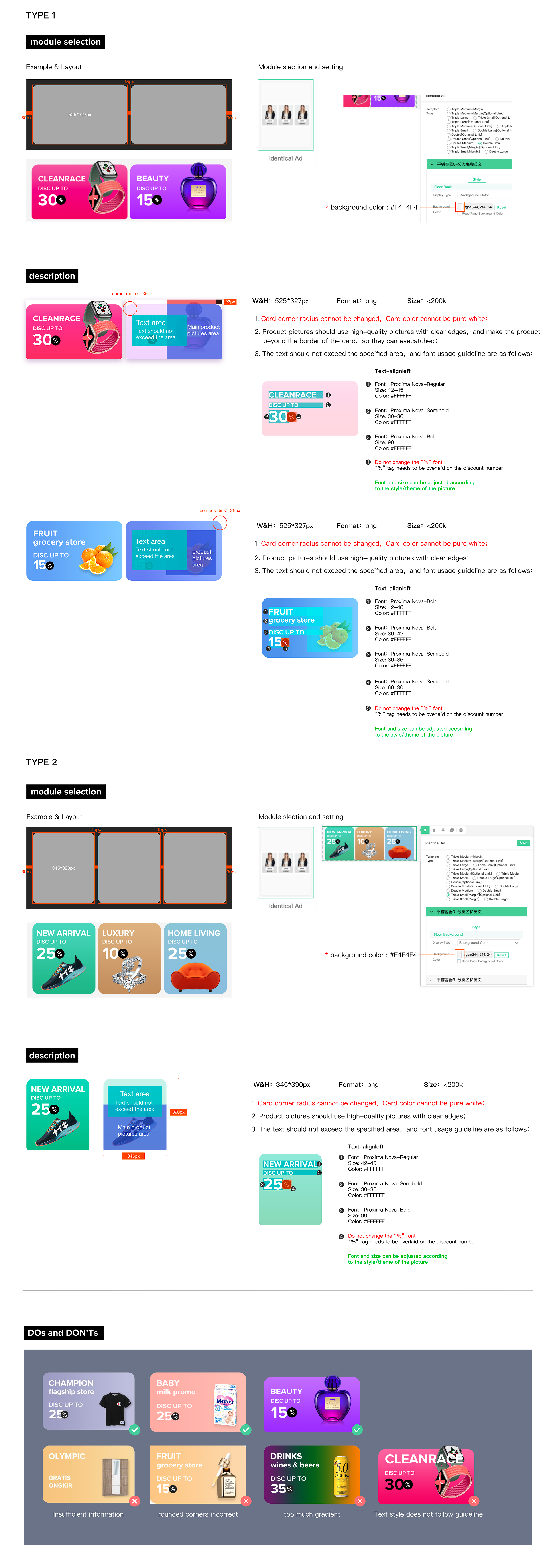
12. Identical Ad
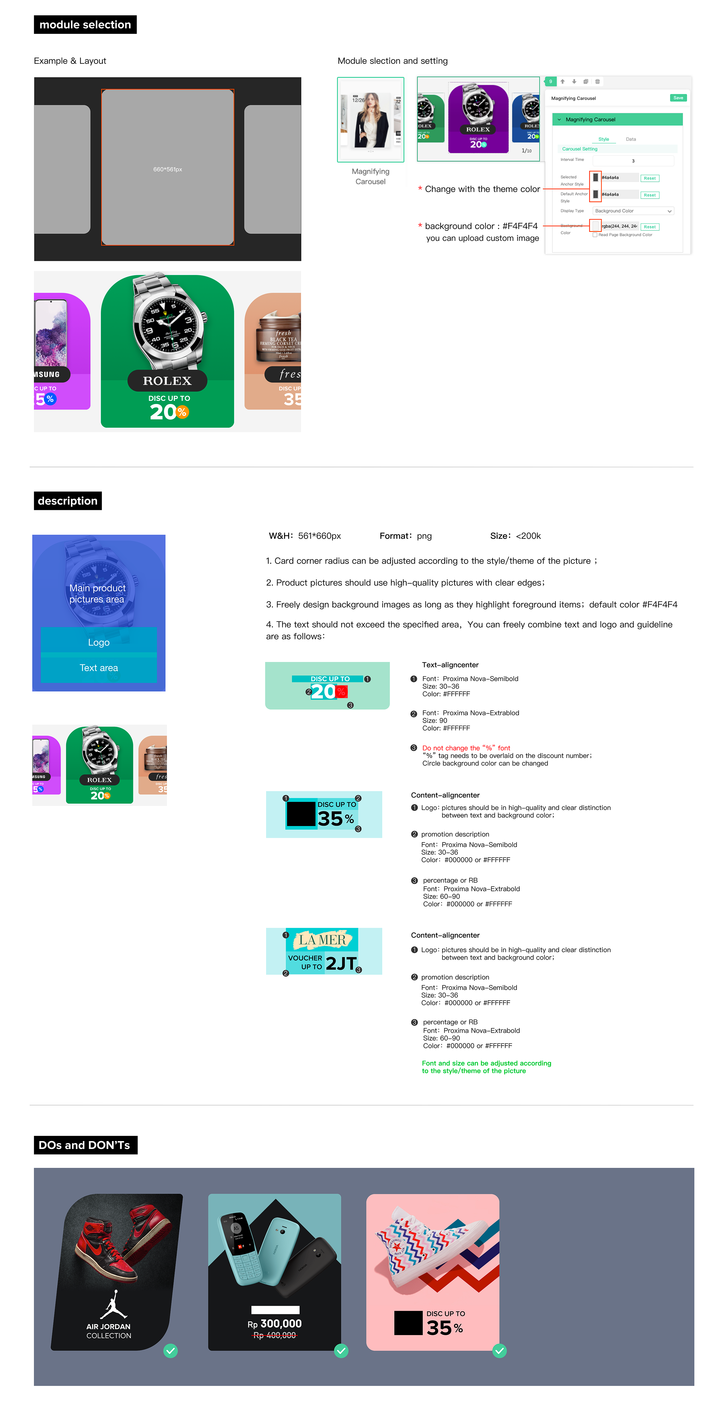
13. Magnifying Carousel
14. Shop
15. Ad Product
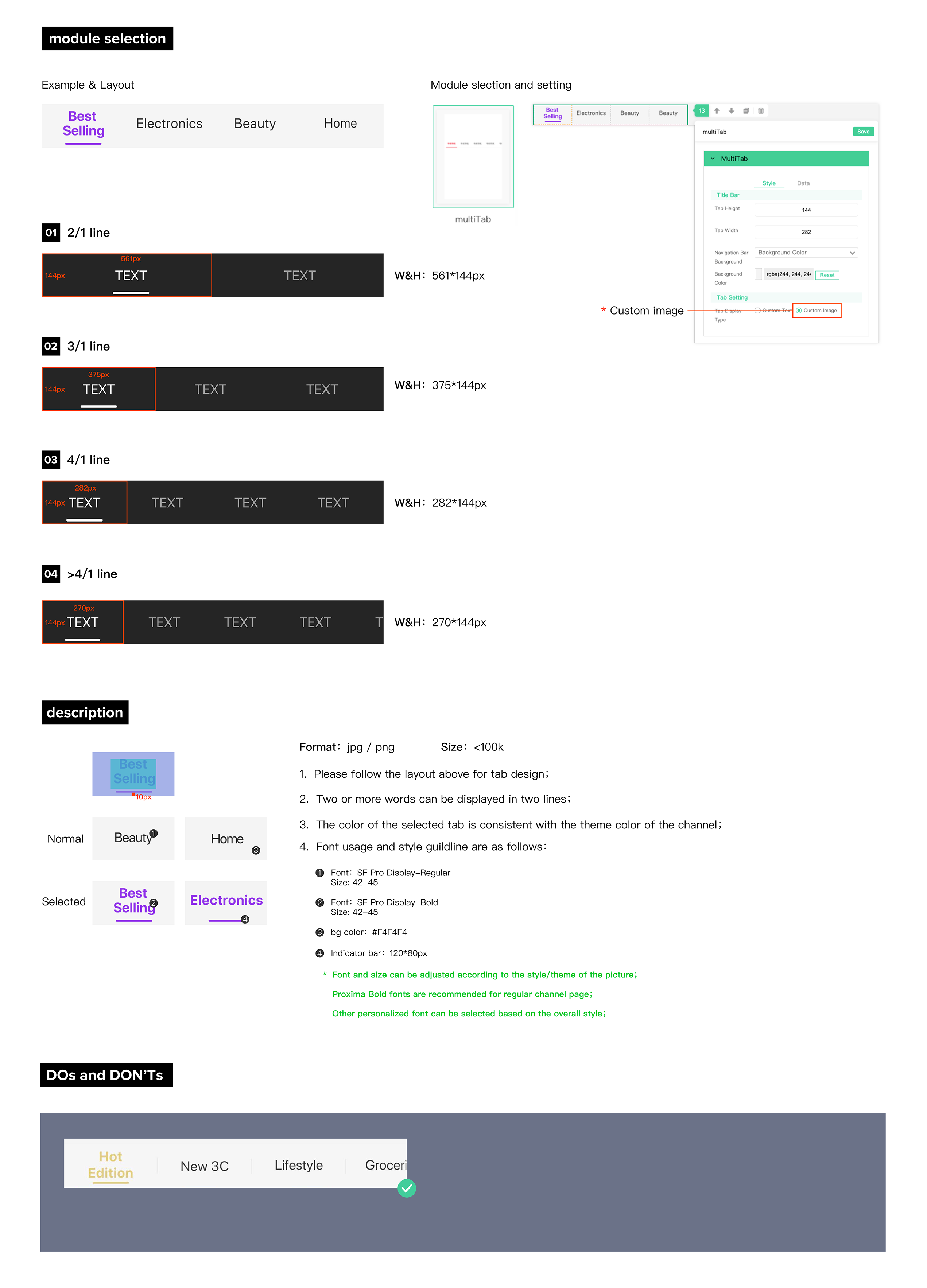
16. Multi Tab
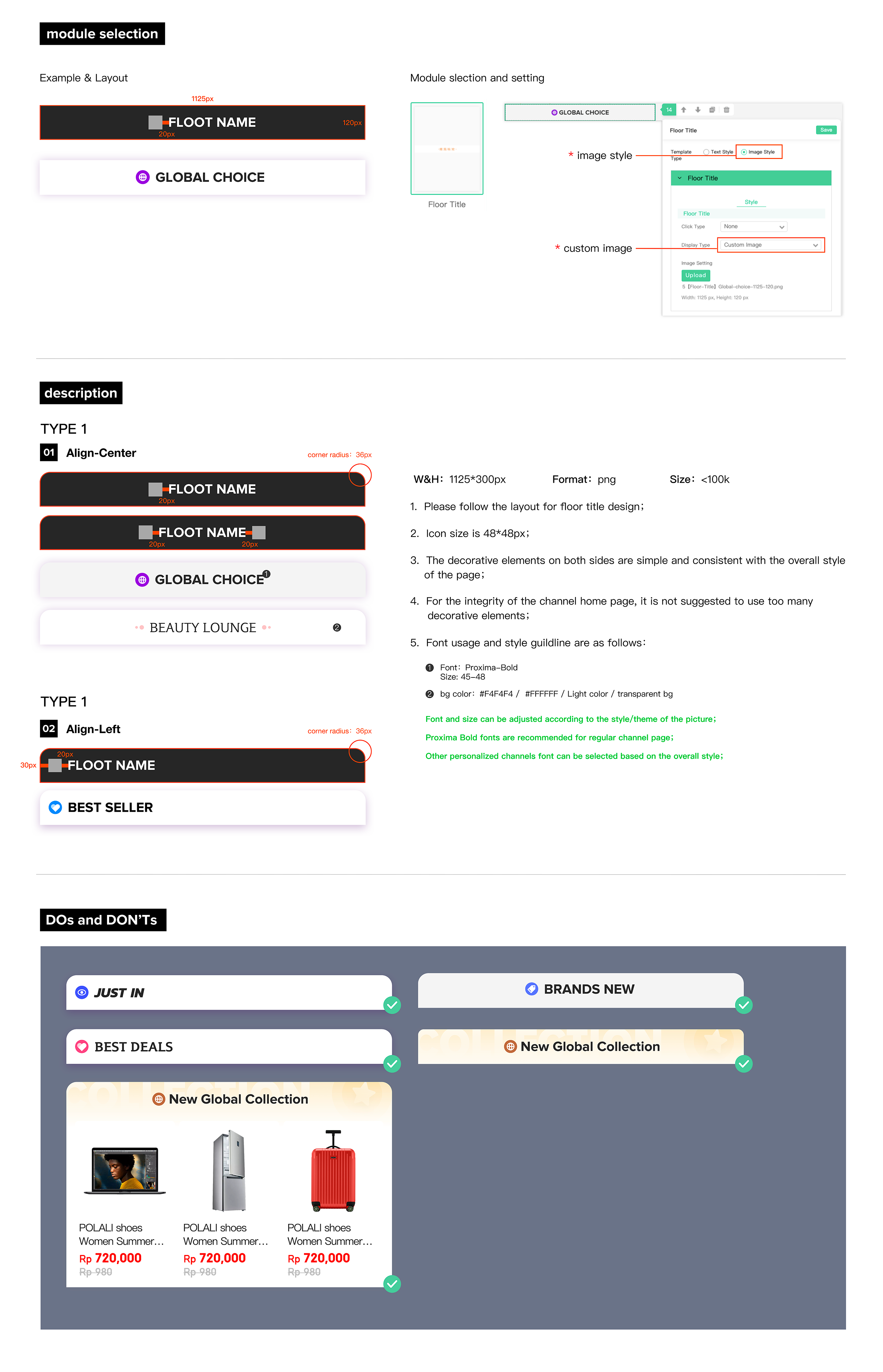
17. Floor Title
