Introduction
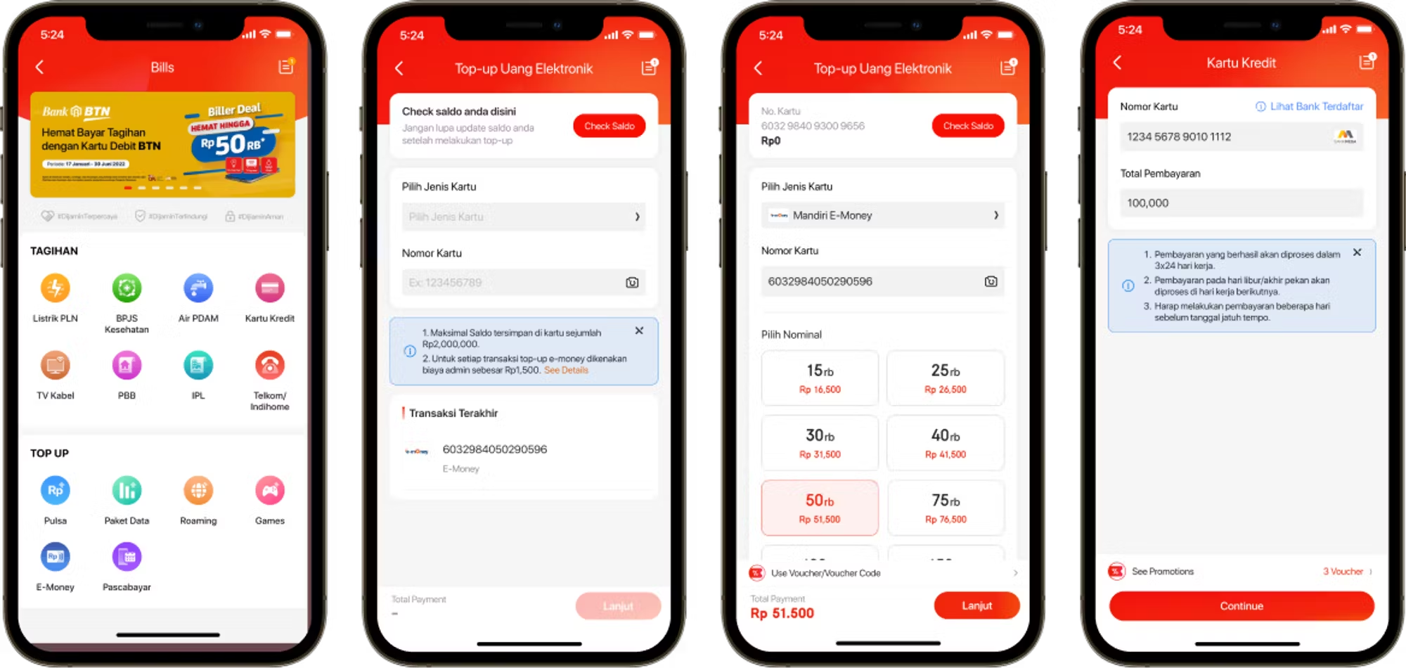
The development of digital products is currently growing rapidly, along with their efficiency and practicality for consumers. JD.ID has 14 digital products which are divided into 2 categories: Bills and Top-Ups where almost all of the appearances are still out of date and not user friendly.
Also we found out in JD.ID:
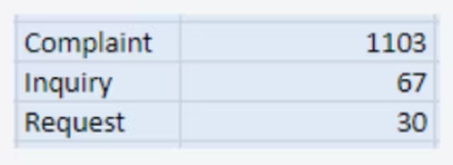
1. There are 1,200 incoming contacts related to Digital product on Jan-Feb 2022 (WK 1-5).
2. >91% (1.103) incoming contacts are mostly customers’ complaint.
Knowing all those facts, made us think how might we clarify the user flow for all digital products with a new look that is easy to use
Process & Milestone

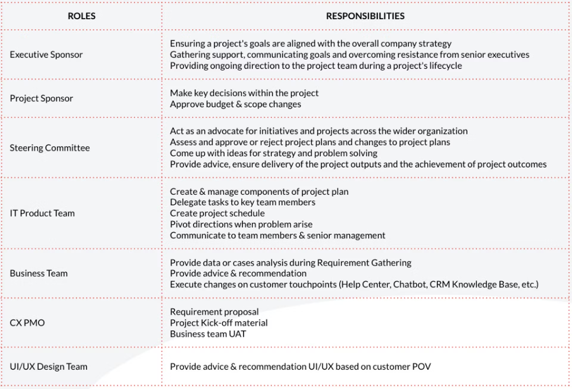
Roles & Responsibilities
Empathize
1. Looking In “Business Side”
We conduct discussion to deep dive each digital product with respective PIC to gain more info related to product details needed to be shown to users. Also we found out in JD.ID:
1. There are 1,200 incoming contacts related to Digital product on Jan-Feb 2022 (WK 1-5).
2. >91% (1.103) incoming contacts are mostly customers’ complaint.
Problem Statement from Business Side
1. Make Consistent and Good UI/UX
2. Make it easier for customers to purchase digital products
3. Increase digital products transactions
4. Increase the conversion rate (unique user id per day)
5. Increase the percentage and GMV of organic user.
2. Looking Around
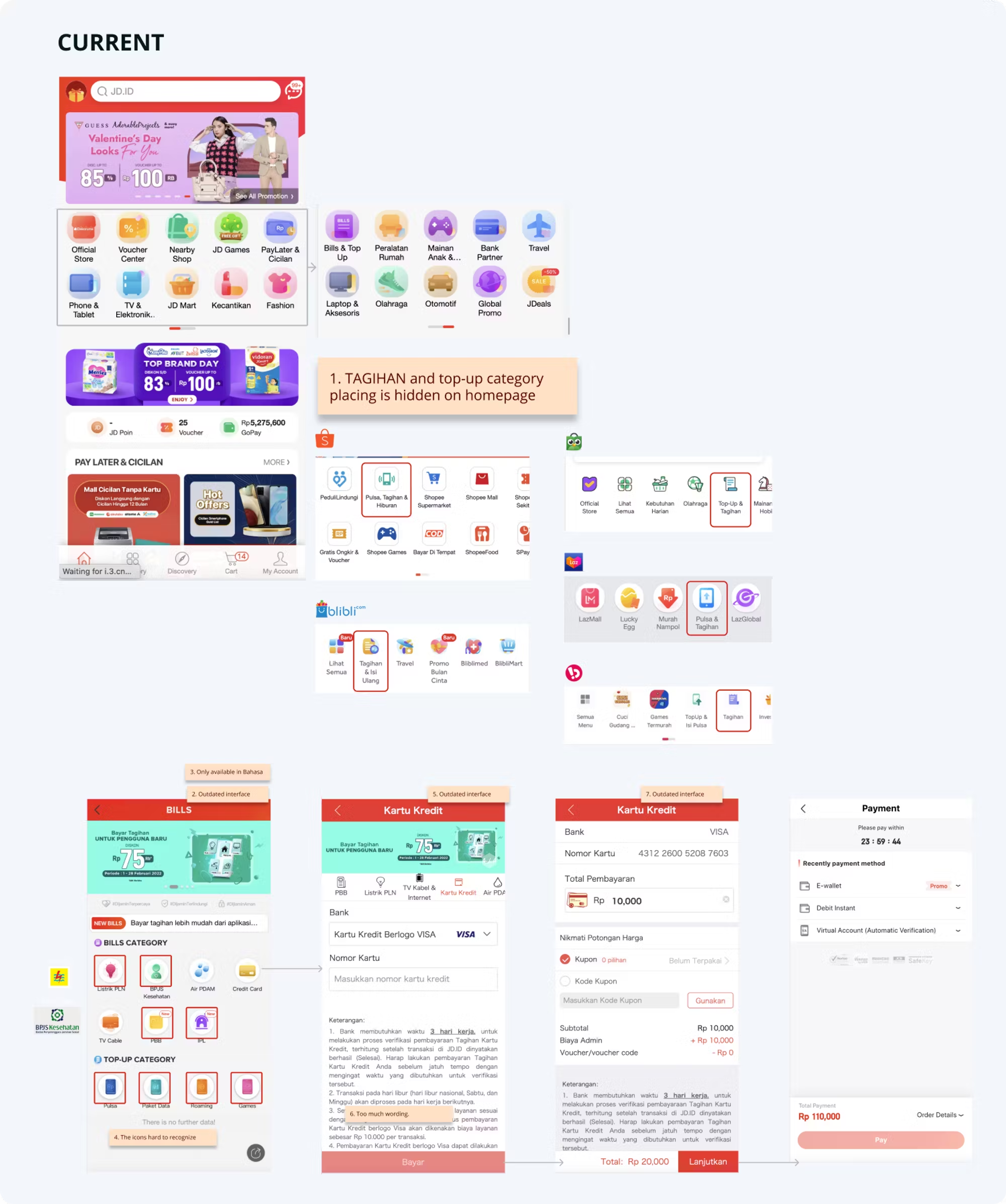
In this stage we do a competitor analysis. Comparing the same features with other apps/websites for additional reference and insight in the ideation process.

3. Looking Out “User”
Problem
💡“Purchase Digital product in JD.ID can be frustrating and confusing,”
Identifying Pain Points
From the results of data processed by our research team and business teams related to digital products , frustration comes when users want to buy a digital product, be it a top-up or to pay a bill. Some users complain that it takes time to find the location of where the Bill & Top-up enterance is, plus the UI is complicated because it is inconsistent, and the information displayed on each biller page is too much, too wordy.


Define
Synthesising Feedback
“Hard to find the Digital Product (Bills & Top-up) icon on the Homepage.”
The entry to go to the Bill & Top-Up page is on the JD.ID homepage but the bills category is on the 2nd slide in the category section, making users confused to find it
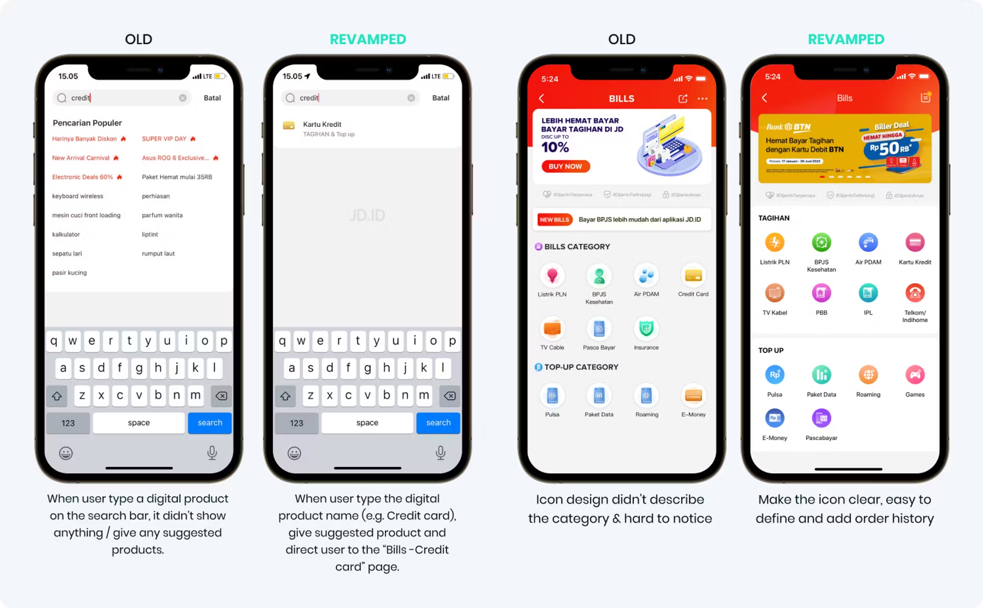
“Search engine doesn’t show digital product recommendation when user key in bill-related keywords.”
Users usually search in the search field to enter the Bills & Top-up page but the search results are not there, making the user frustrated.
“The logo is not consistent, hard to notice and distinguish.”
icon should help the user in selecting and interpreting a product quickly instead it confuses because the shape is not clear
“No Order History to view all transaction history of the digital products.”
No order history led to frustrated when user wants to check transaction status or transaction history that has been done previously
“The information is too much, too wordy.”
Too much information displayed on each Bills & Top-up landing page makes users lose their main focus on making transactions or payments.

Ideation
🧩 Multiple Iterations.
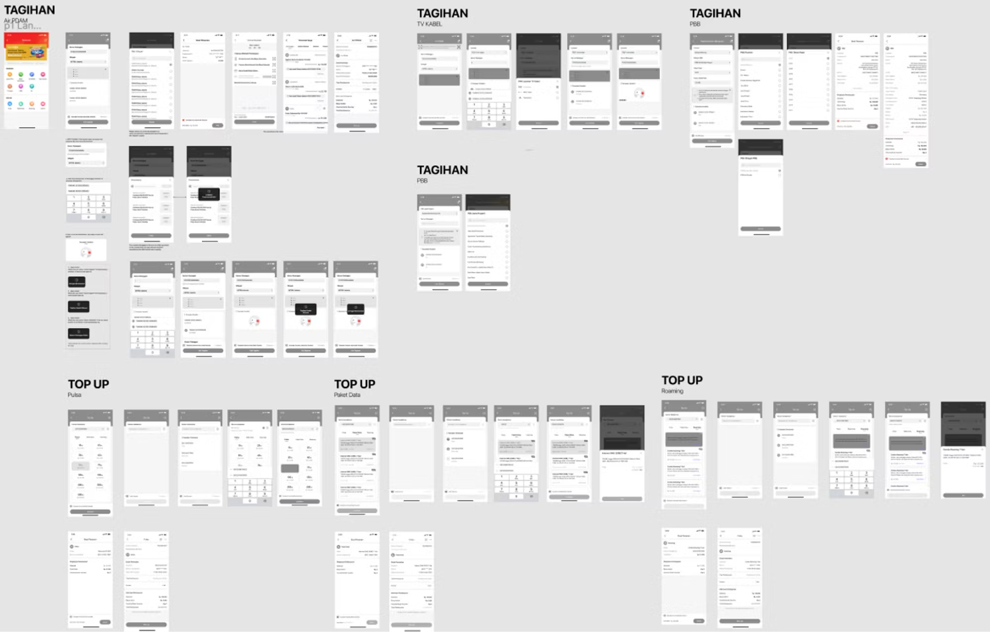
After designing with many option, and we decided to get the feedback quickly with this design option 1, we all do the design review with all related PIC, PM and stake holders and get the design feedback.
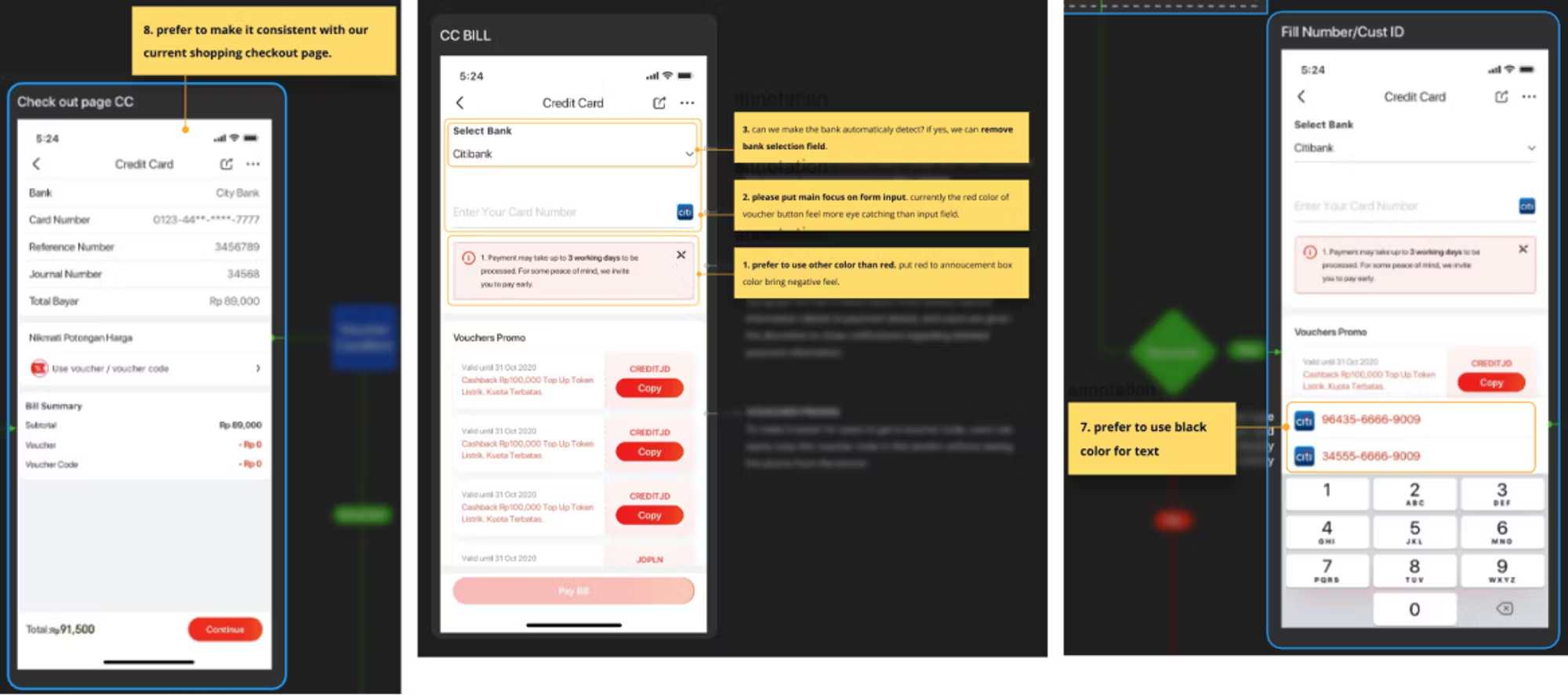
Integrating new flow

Final Design
After designing process with various options--> get feedback (Deseign Review) --> iteration design again and again finally come up with this final design result :)
Search & Homepage
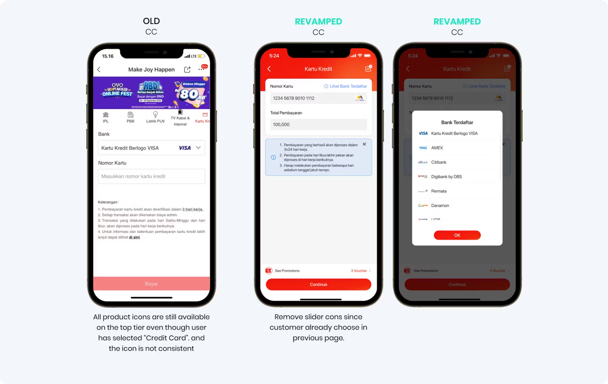
Biller Product - Credit Card
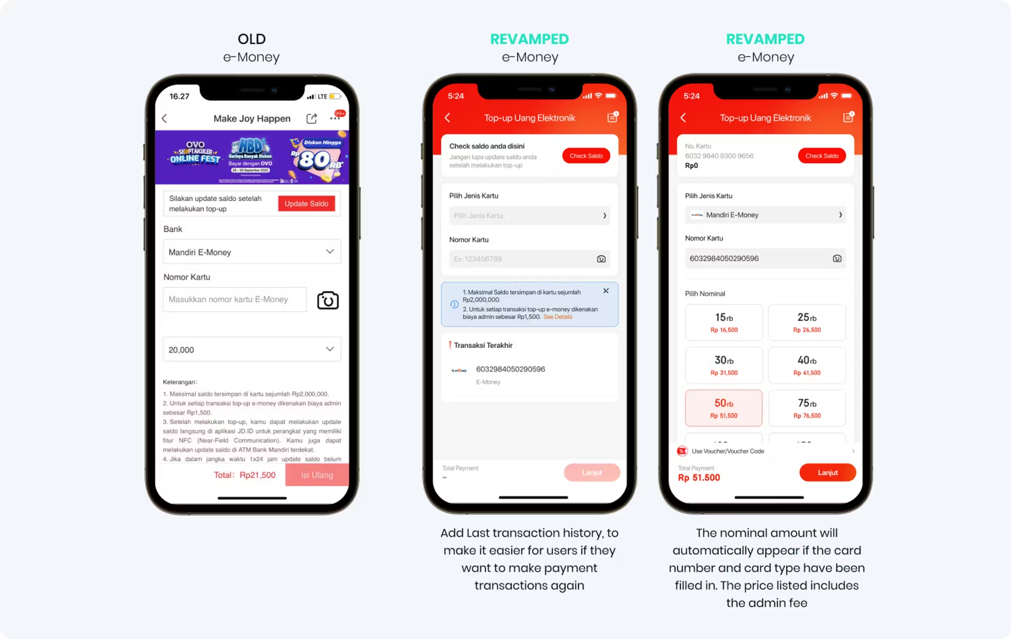
E-Money
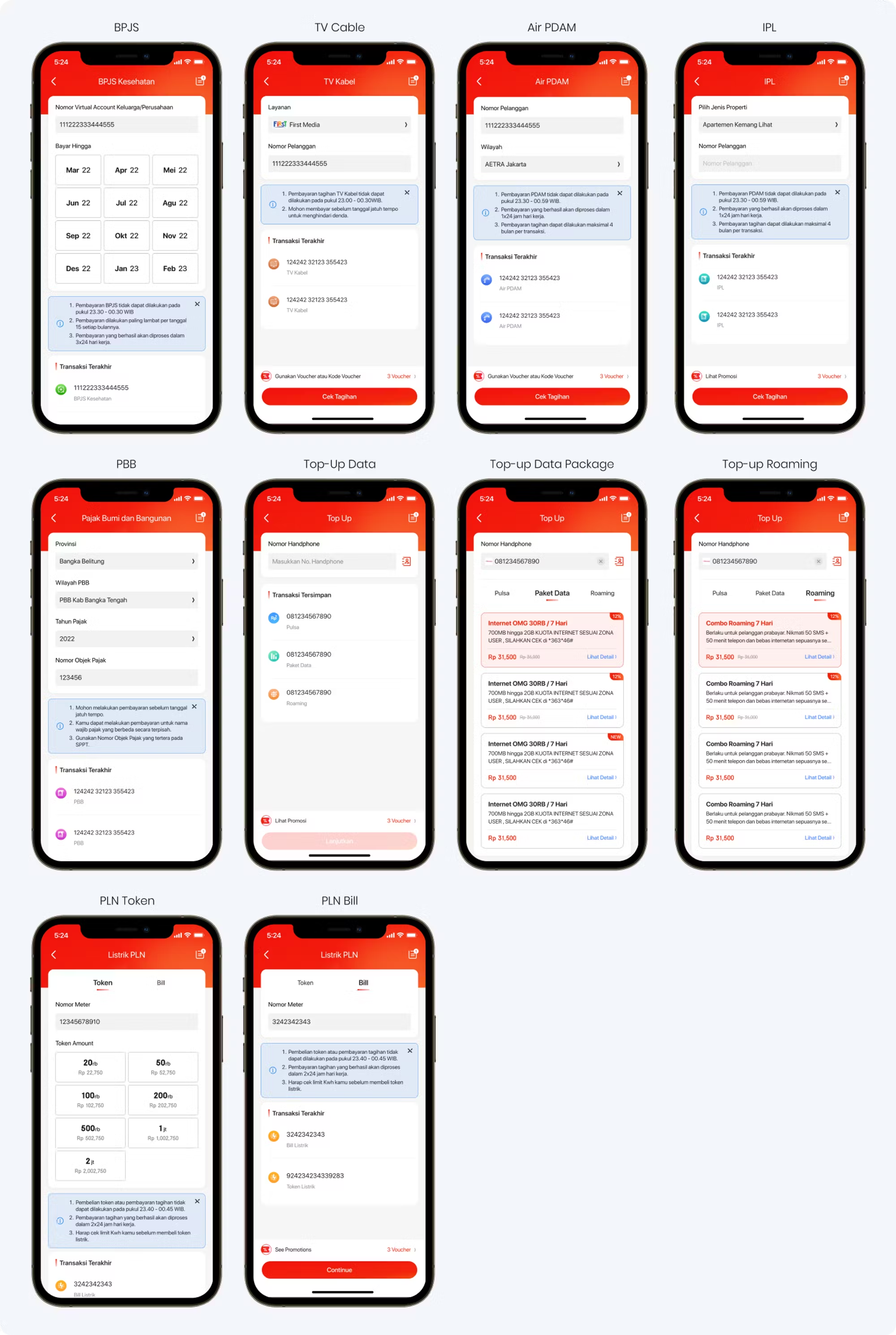
Other Digital Products Revamped
New User flow
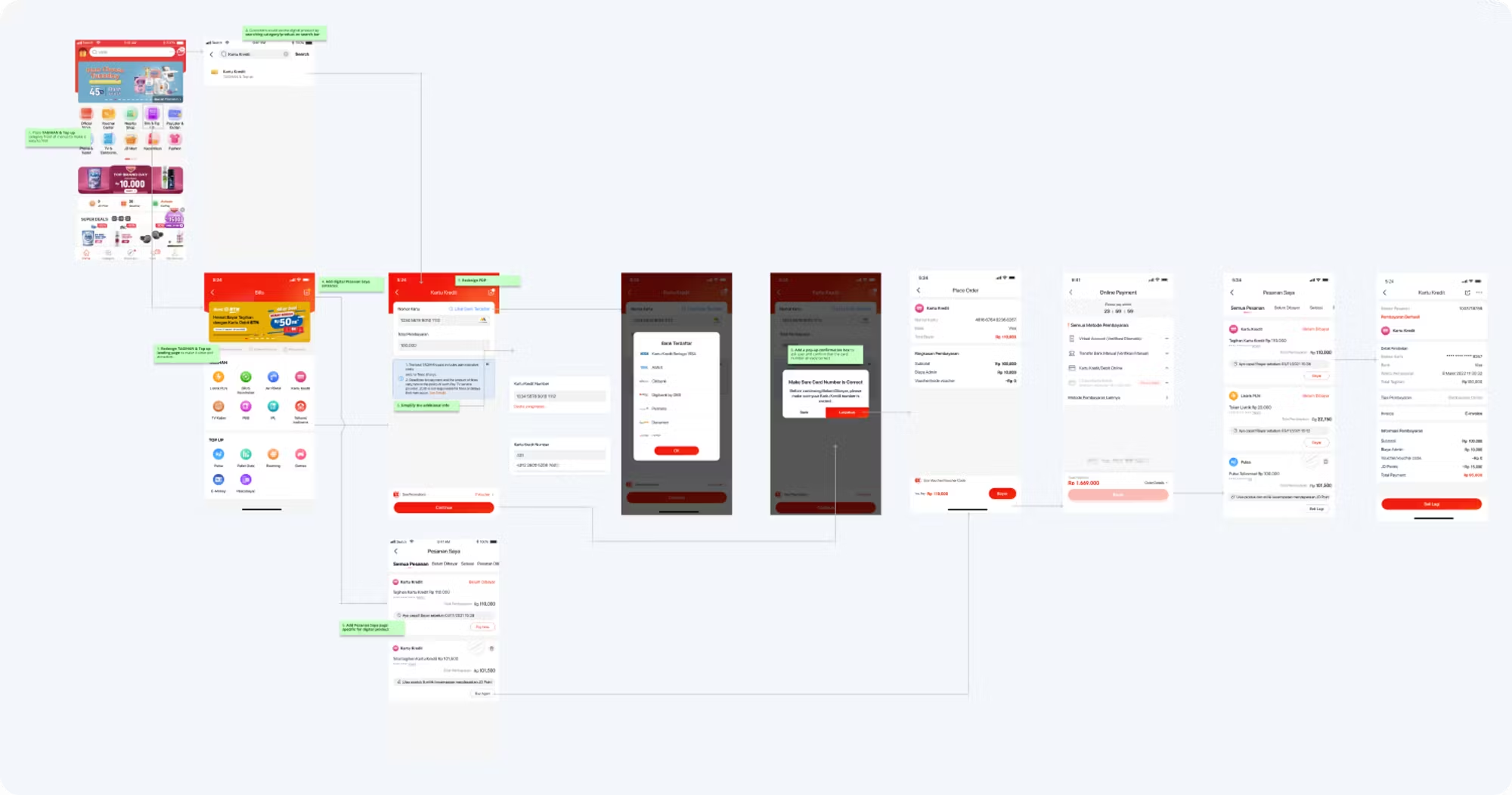
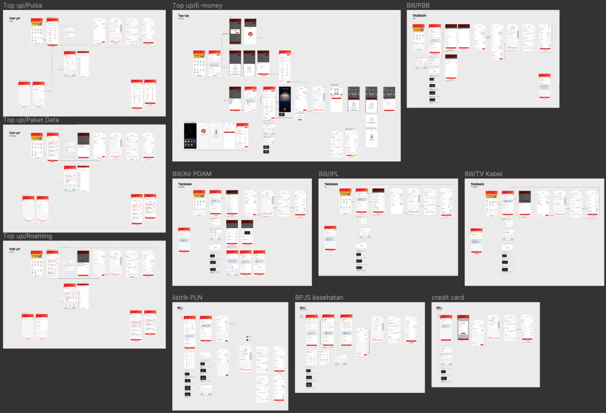
All Detail flow for Digital Products Revamped
Lesson Learned
In this project I learned so much how we collaborating with multiple teams such as engineer, PM, data team, business team and Product design team from beijing (JD World Wide, JDW) in every process of crafting design to provide advice & recommendation design based on customer point of view so that the experience of MF Purchase flow at JD.ID is more comfortable
Balancing business needs and user needs. In order to unify the business goals and user goals that we have agreed on together, I must continue to coordinate with the PM, the Digital team, and the developer's team to request data and make sure the design made is feasible.
This project is still in the Unit Testing, System Integration Testing, and User Acceptance Testing stages and will be live soon on the JD.ID application in a few months! I will update it again how the results of the test results :)