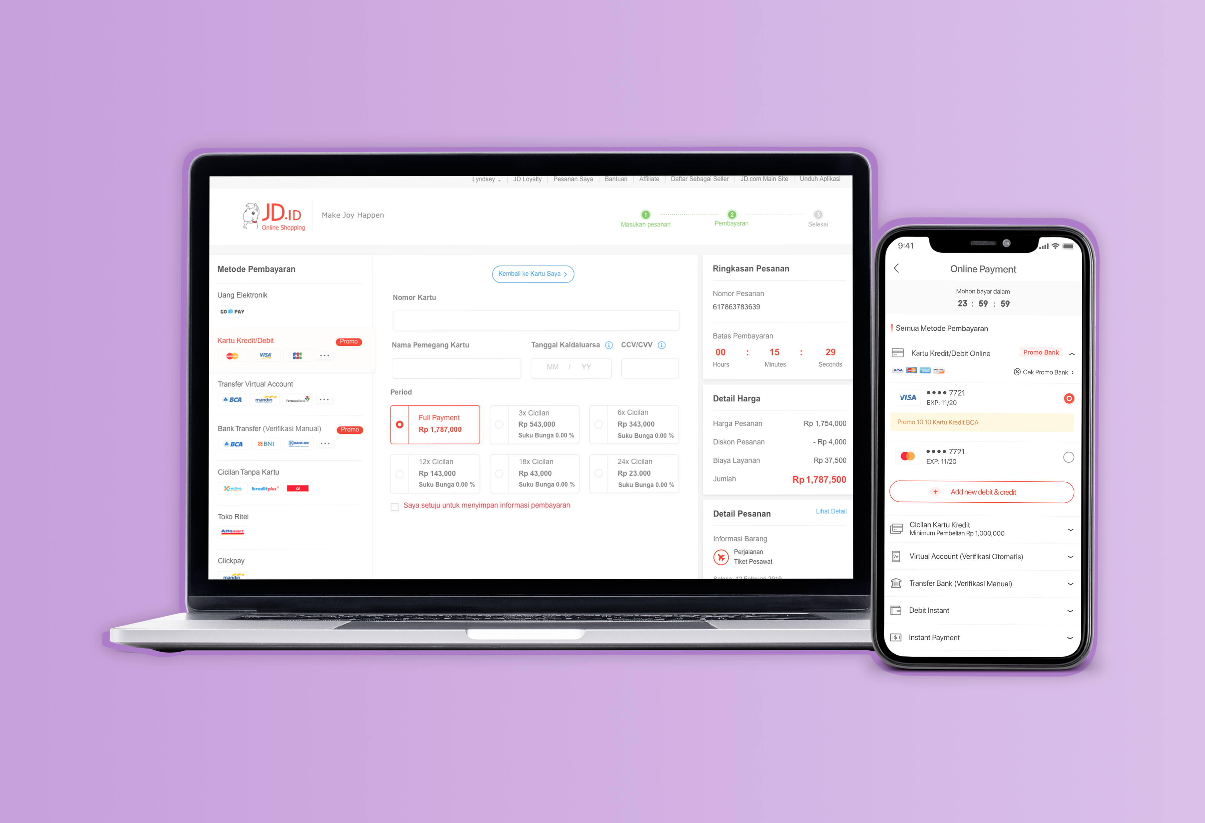
1. Goals
To optimize the new JD cashier and make user friendly
2. Background
Indonesia has a variety of payment methods, therefore the new UI design is created more categorized (from general to specific payment)
3. Key Point
- Based on data, Indonesian people users pay with one kind of payment method (1092439 users).
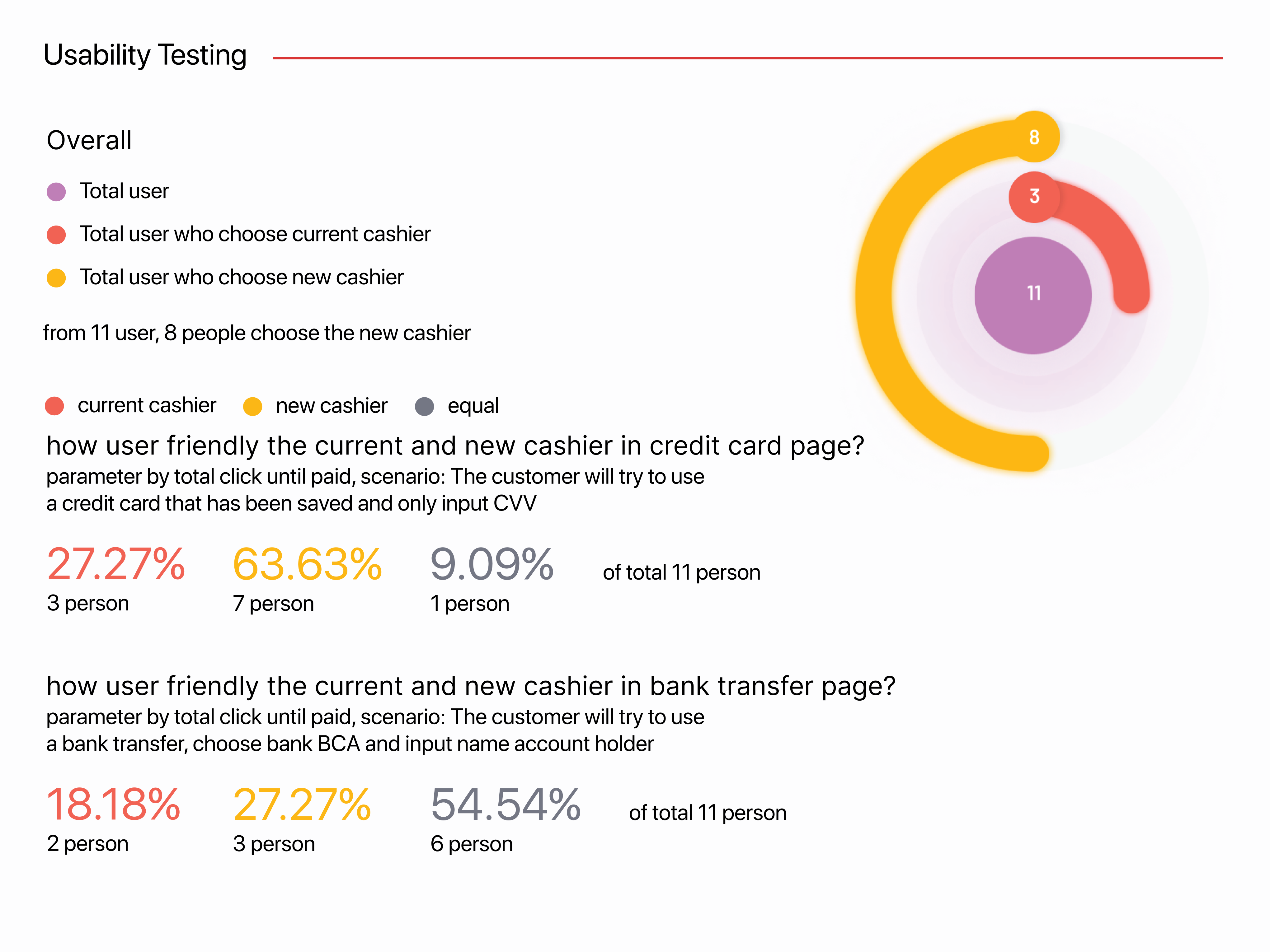
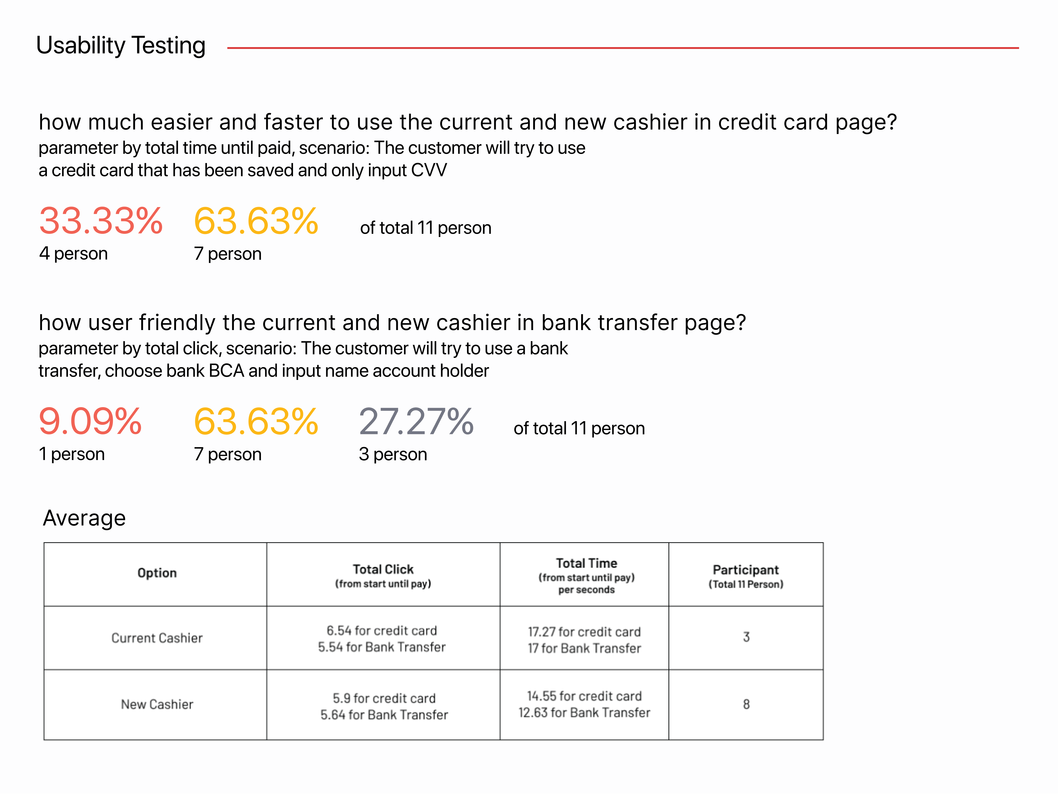
- Based on usability testing, 7 out of 11 people choose the new design because it is more simpler and easy to use.
4. Concept
Generalize > Specific
5. UI/UX Design flow
- Cashier Homepage: Click payment method then will jump into cashier detail page
- Cashier Detail page: Select payment user want to use and then make a transaction
6. Method
- Comparing Analysis: Our current cashier ( Virtual & Physical products) and two com- petitors (Total comparison = 5)
- User Usability Testing: See where they encounter problems and experience confusion
- Collecting Data Based on behavior of Indoneian people
PC Version
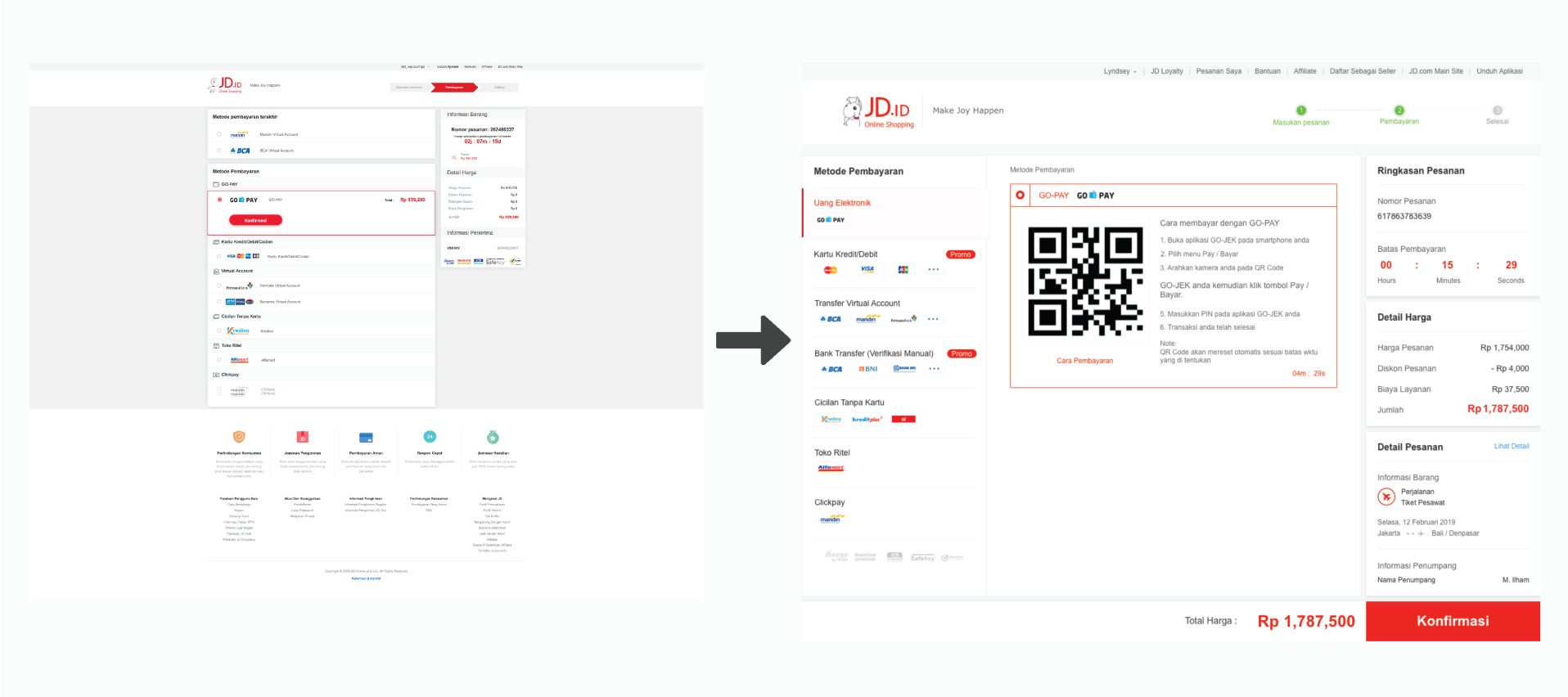
Our concept is about redesign the cashier UI inspired by Indonesian customer habit and trend design in indone- sia, for compete with other ecommerce or competitor. we make this design more looking good and user friendly. we propose a different layout and structure information, we make it into three section the first one is leftbar menu, middle for content and right side about detail payment information
1. Leftbar Menu
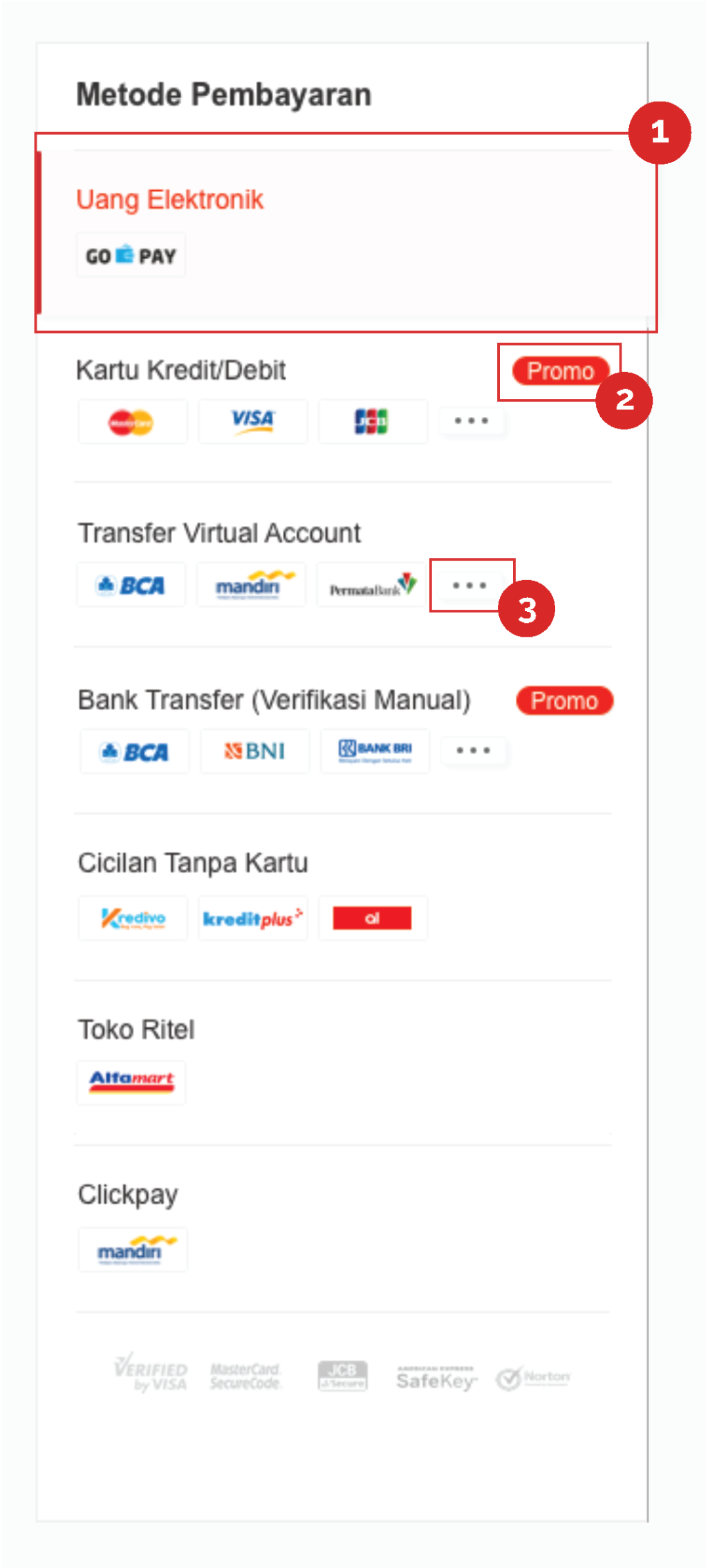
Usefulness and purpose :
all payment method will show in leftbar. the action for this part when customer click. will showing the data in the middle section
1. Active payment method
2. icon promo is to represent the payment method that has a promo
3. this icon for represent information the payment method has more than 3 sub payment method, if you hover will be showup all sub payment method
2. Gopay Section
We display the QR code for customers to scan from their smartphone
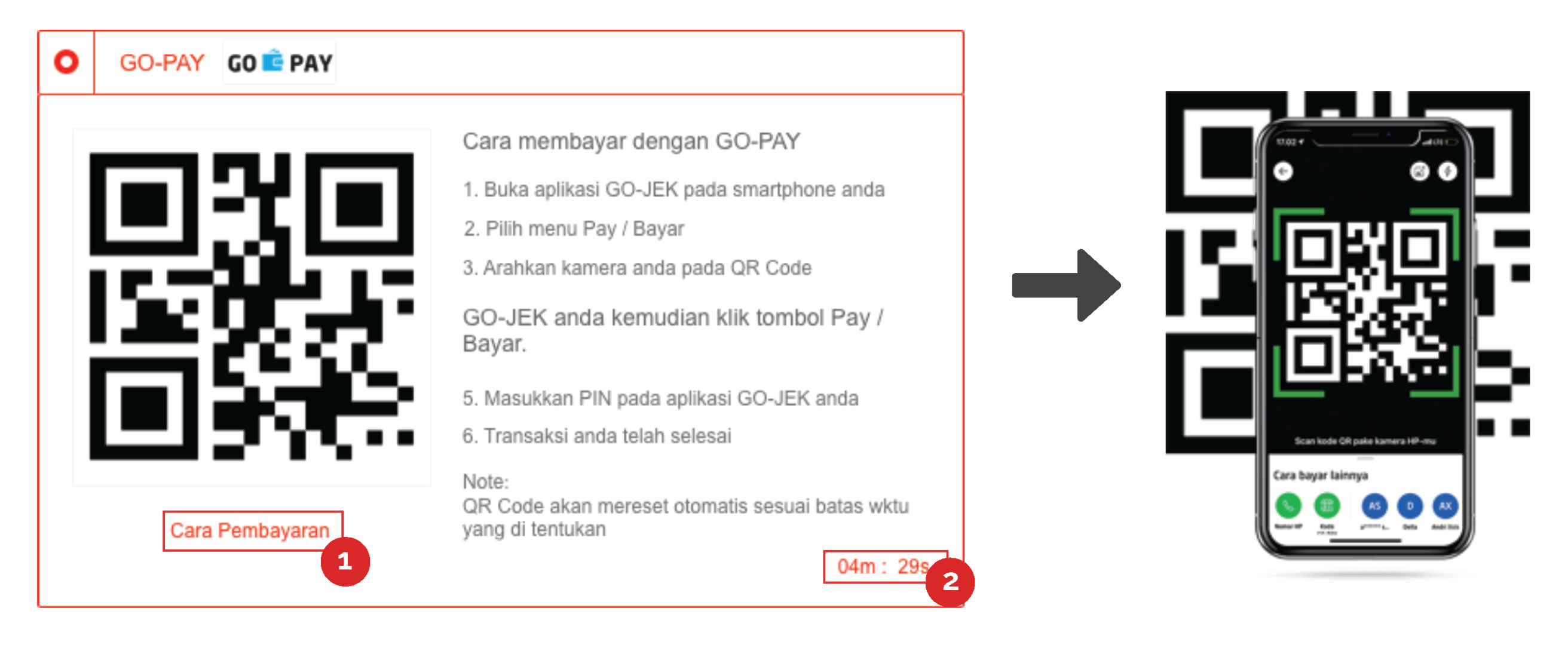
Usefulness and purpose :
all payment method will show in leftbar. the action for this part when customer click. will showing the data in the middle section
1. Cara pembayaran can be click to pop up image the tutorial pay with gopay, because the image is gif and more interactive than before
2. the time expired to reset automatically to new QR code
3. Bank Transfer, Virtual Account, Toko Ritel Section
Input data like phone number, Name Account Holder, and Information promo if there has promo
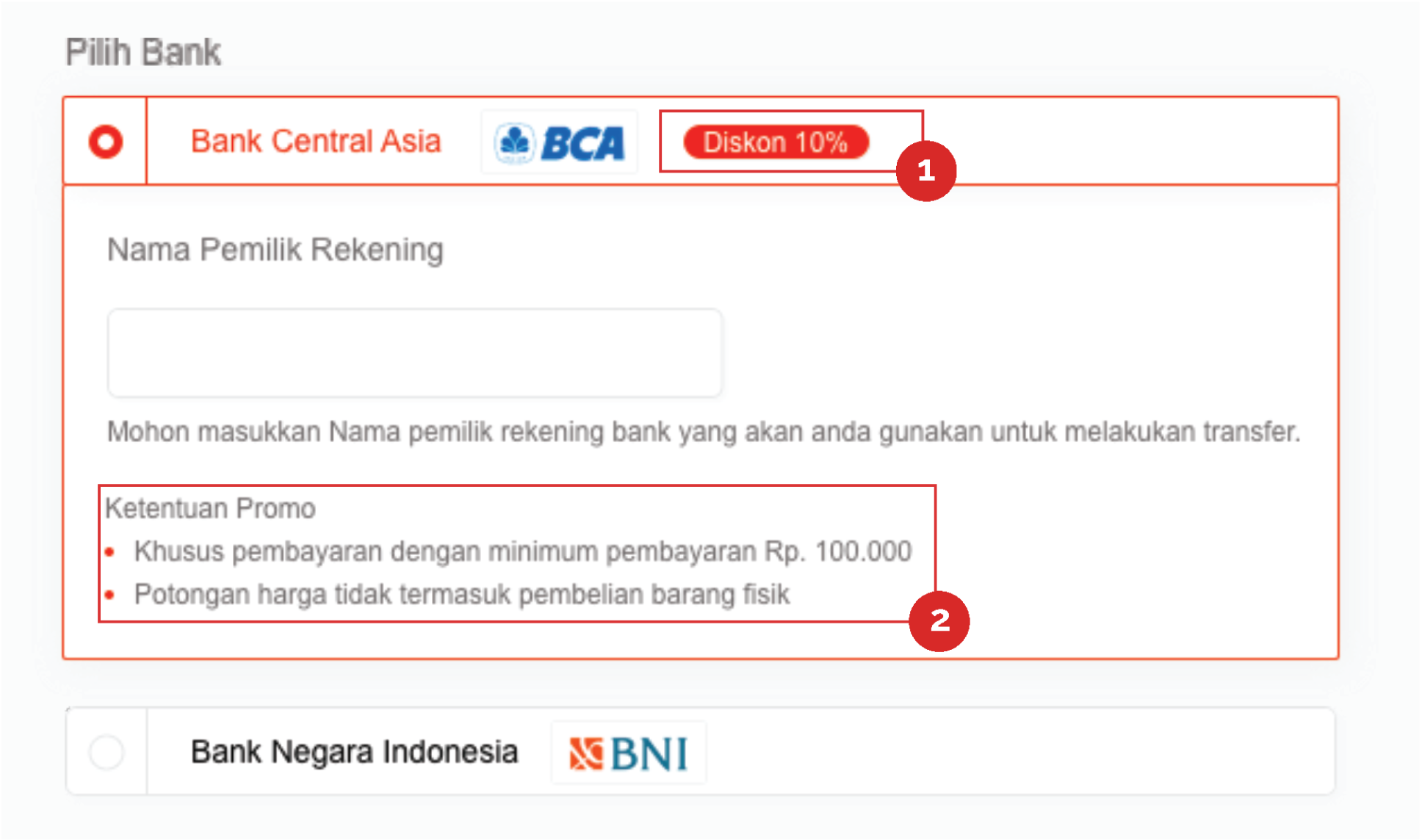
Usefulness and purpose :
all payment method will show in leftbar. the action for this part when customer click. will showing the data in the middle section
1. Icon promo with value of discount to show information promo more detail
2. rules and policy discount for give information to the customer will be sure to use this method
4. Multifinance Section
Customer choose the period installment in provider you choosen

Usefulness and purpose :
1. “Lihat perbandingan” can be click to show up the pop up and give the information to compare price in provider and another provider
5. Credit Card Section
credit card section will be choose a used card you have or add the new credit card, and choose period for install- ment or full payment
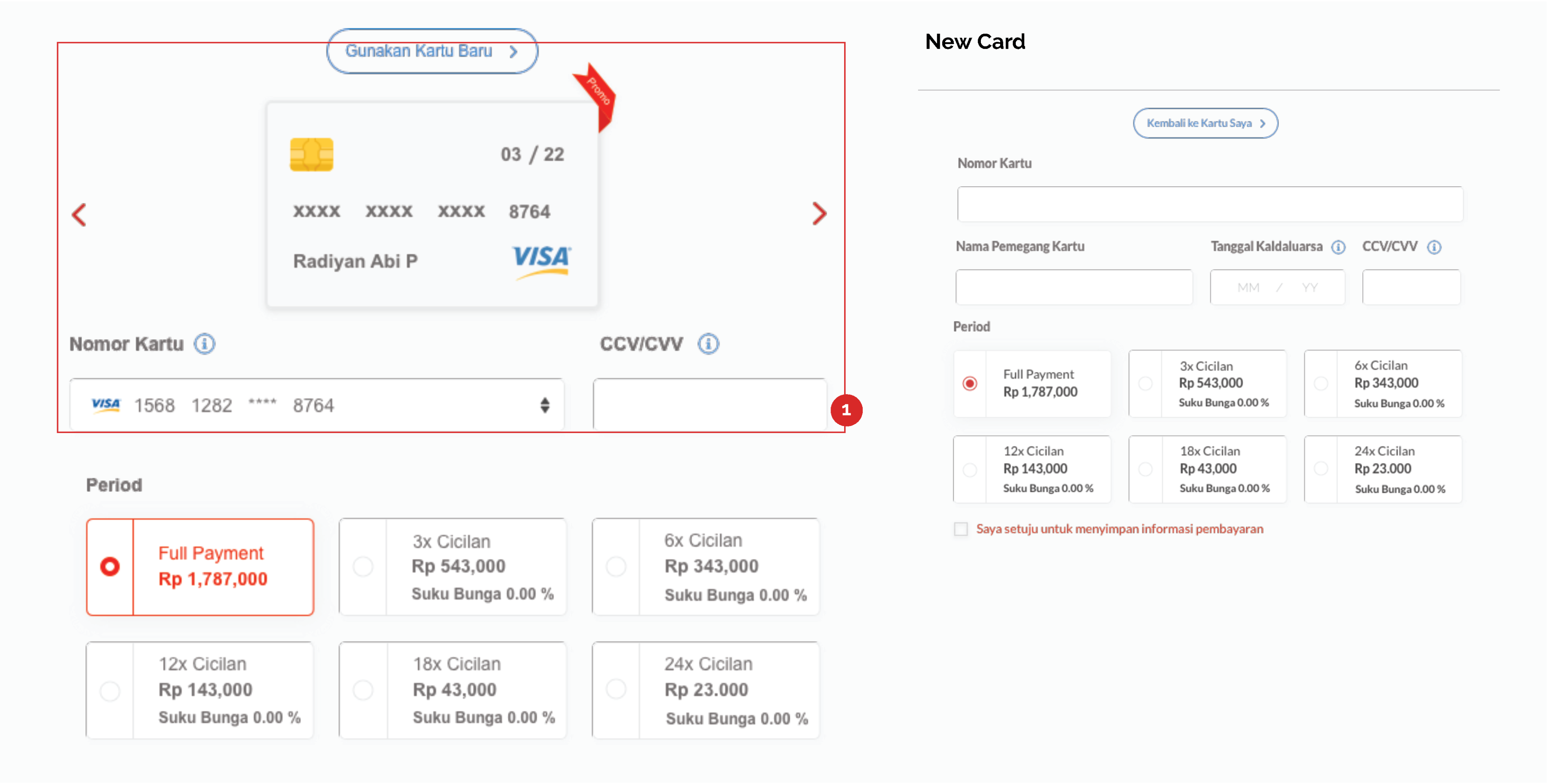
Usefulness and purpose :
1. your credit card that you have used will be choose by arrow beside credit card image or choose in drow down in the second line because if you have a lot of card you will be choose easy in dropdown. icon promo to represent credit card has a promo
5. Right navbar Summary of Order
detail payment information
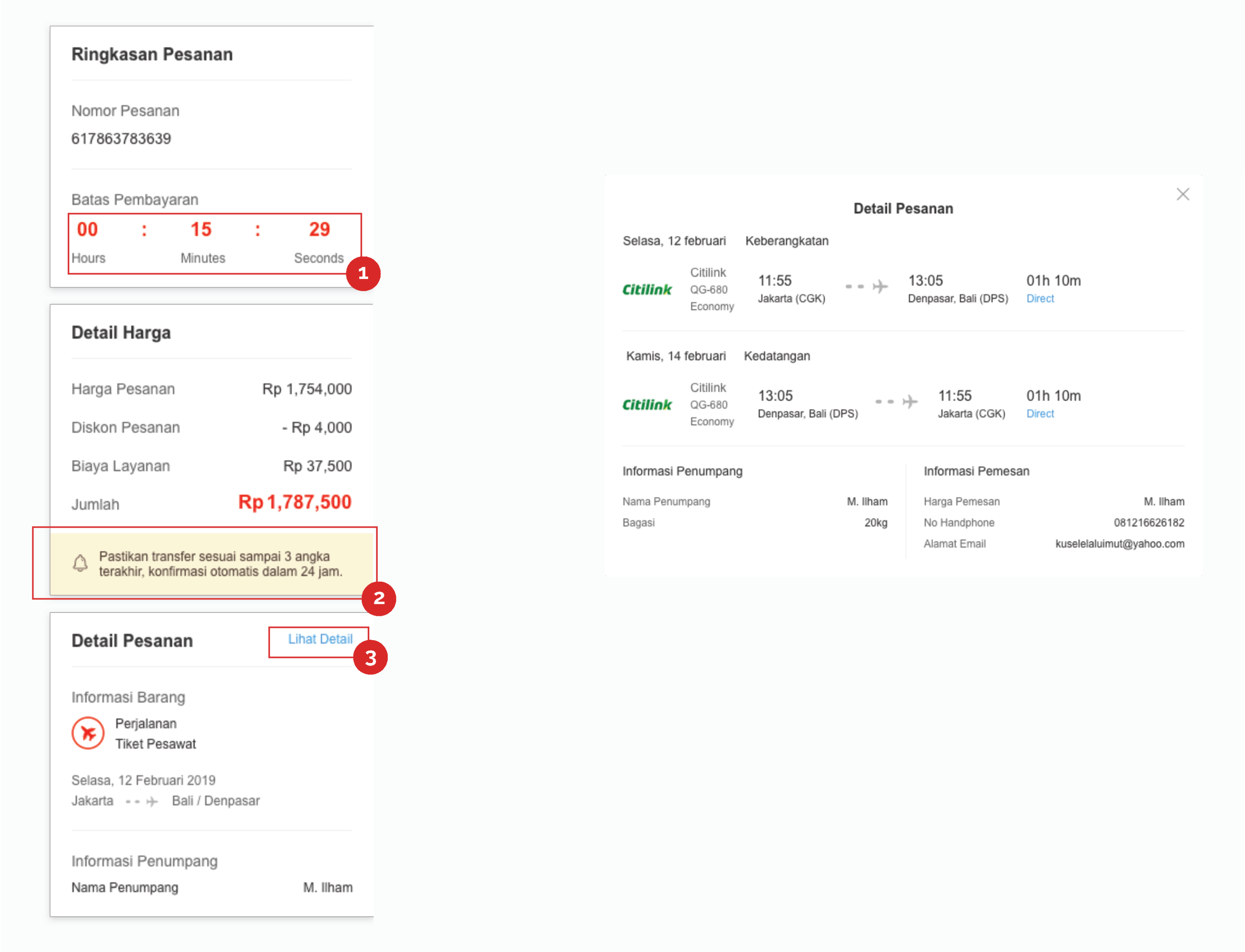
Usefulness and purpose :
1. order time expired.
2. this part to show information to customer notice when you buy with Bank Transfer be- cause have last three unique number
3. “Lihat detail” can be click to show up the pop up information detail order
Mobile/Apps Version
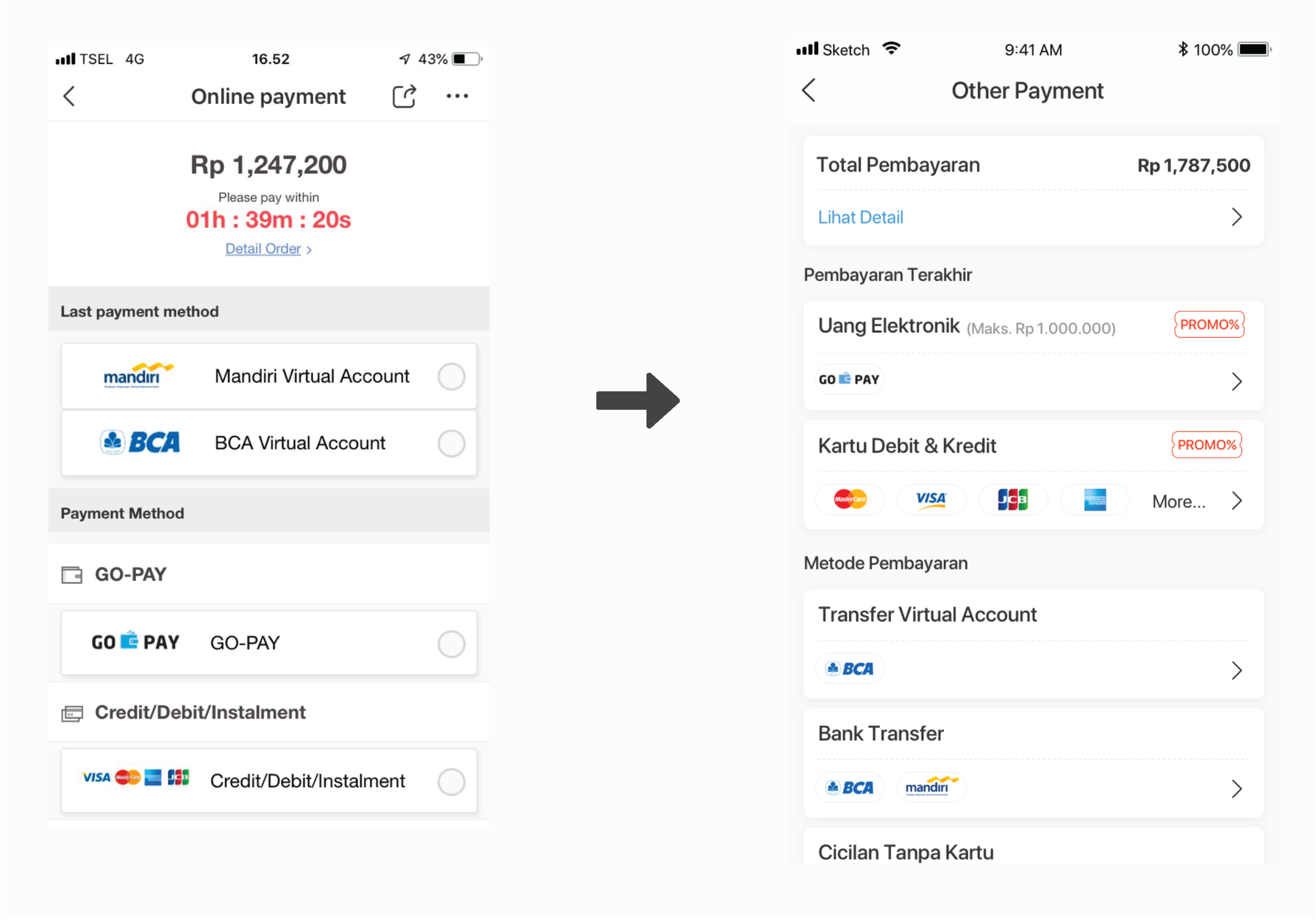
Our concept for mobile is compare with other competitor we follow trend mobile design in payment method page. Current designs do not follow the existing guidelines in mobile apps which are not consistent and different with other page in mobile apps. that the reason we want to revamp the UI to make it more consistent, user friendly and good looking.
1. Landing page cashier (detail payment information)
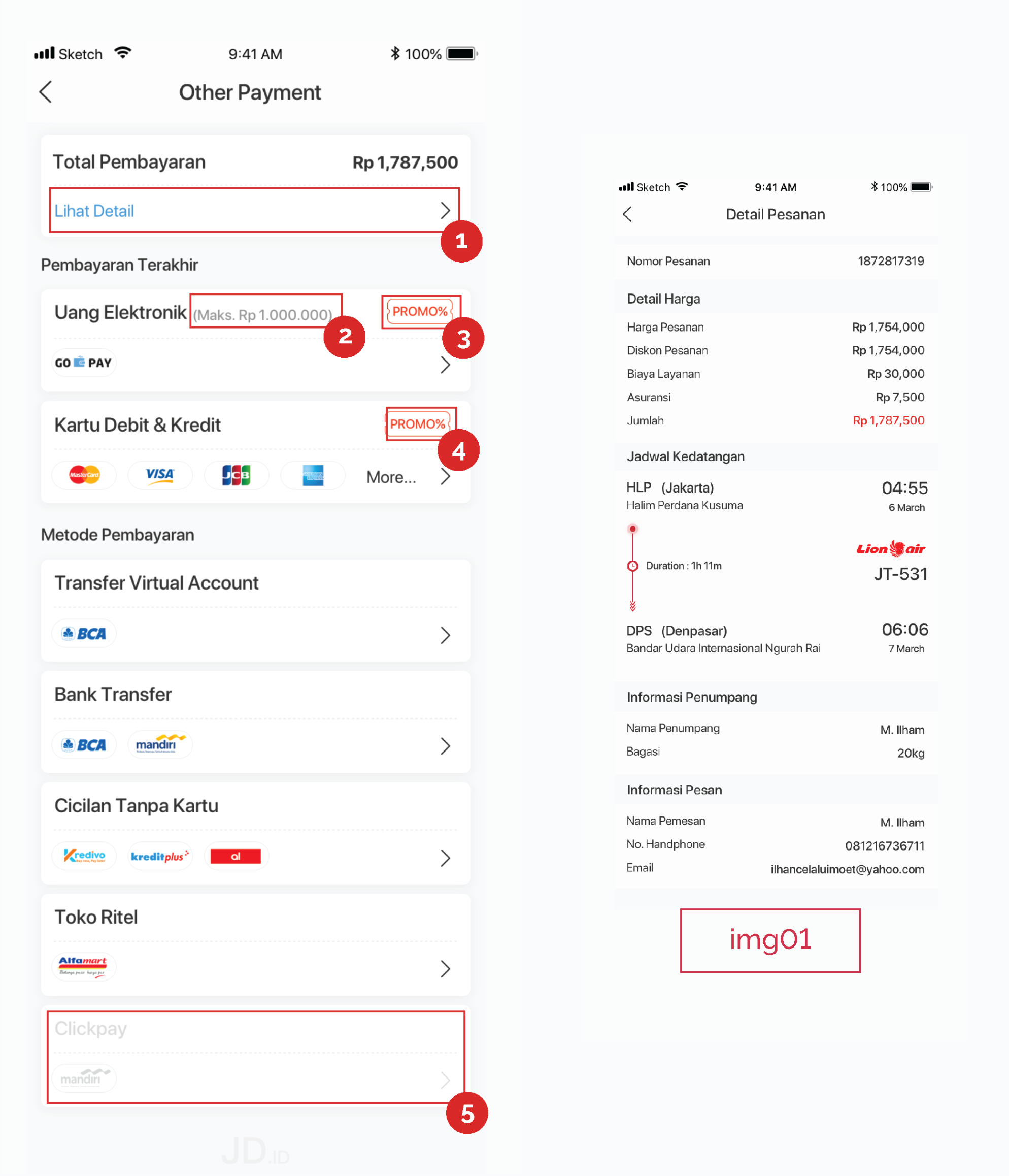
Usefulness and purpose :
this is our landing page to payment module or smart cashier.
1. will show the order & payment detail when user click ‘lihat detail’ section we made a full page pop up because detail order its to many information must be show [img01]
2. (Maks. Rp 1.000.000) in electronic money we can pay a payment amount under Rp.1000.000.
3. icon promo is to represent the payment method that has a promo.
4. “more” purpose its make a customer notice about many more company for this section.
5. this section for give example if the payment method under maintenance, not provide, or coming soon and dis- able looks will be show
2. Go-Pay
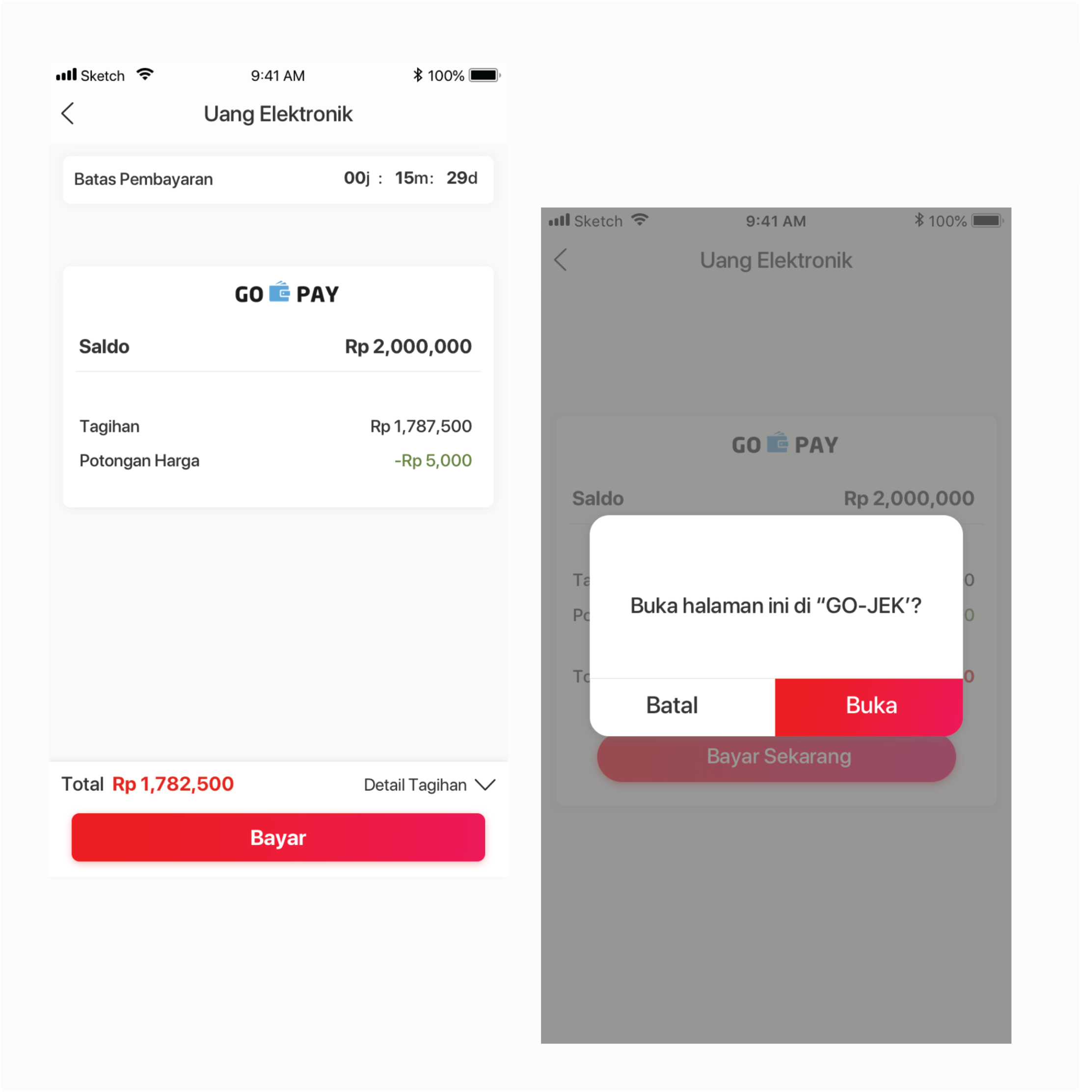
Usefulness and purpose :
Gopay method will be move to another page and show the detail price with gopay balance. and than if you click a button “bayar” will be show the pop up confirmation.
3. Bank Transfer (Verikasi Manual)
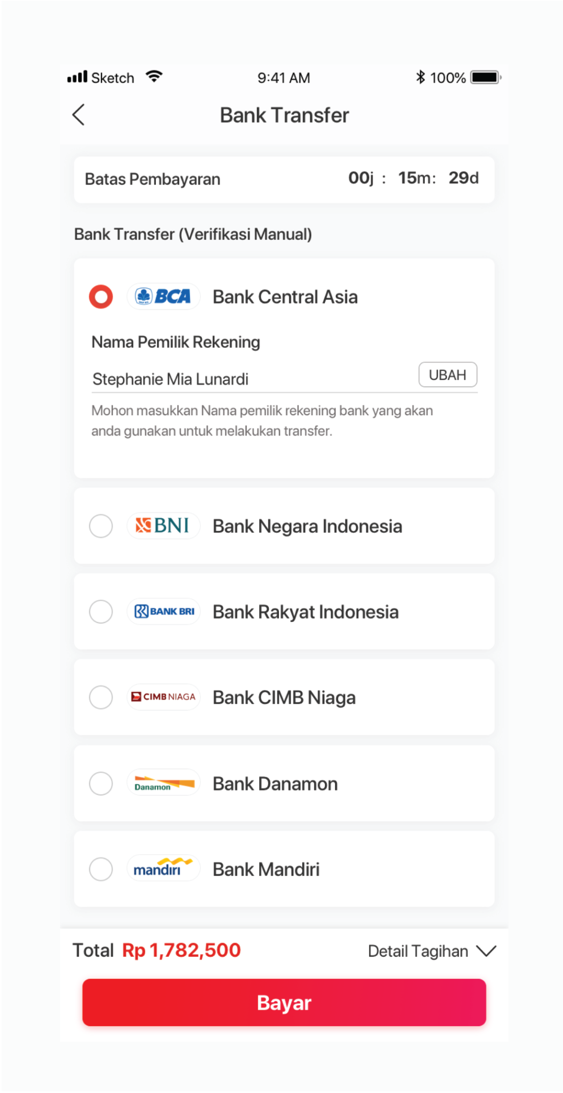
Usefulness and purpose :
this page same layout with virtual account and toko ritel, but bank transfer need to input for a name account holder for data verification.
4. Virtual Account
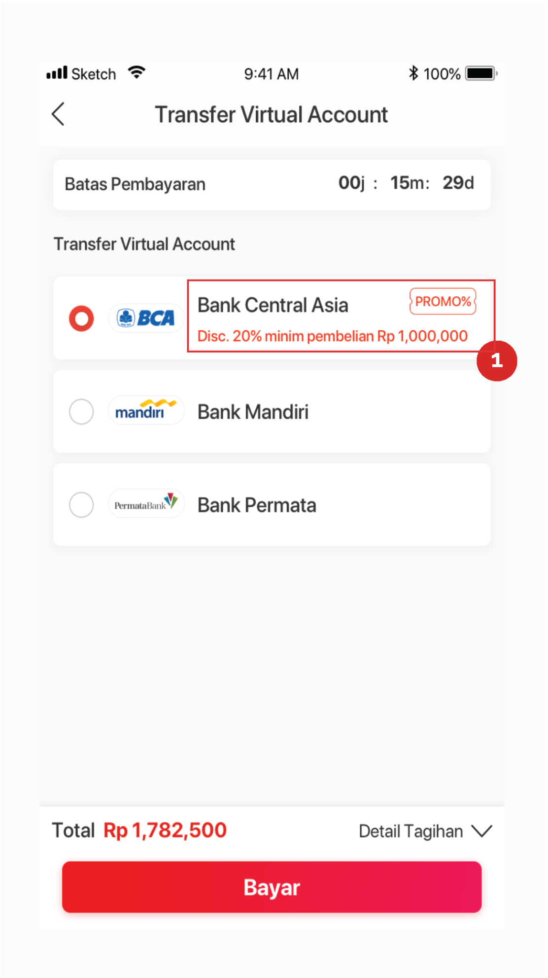
Usefulness and purpose :
this page same layout with Toko ritel and toko ritel, but Virtual account need to input for a name account holder for data verification.
1. the red text for inform the customer about a promotion
5. Toko Ritel
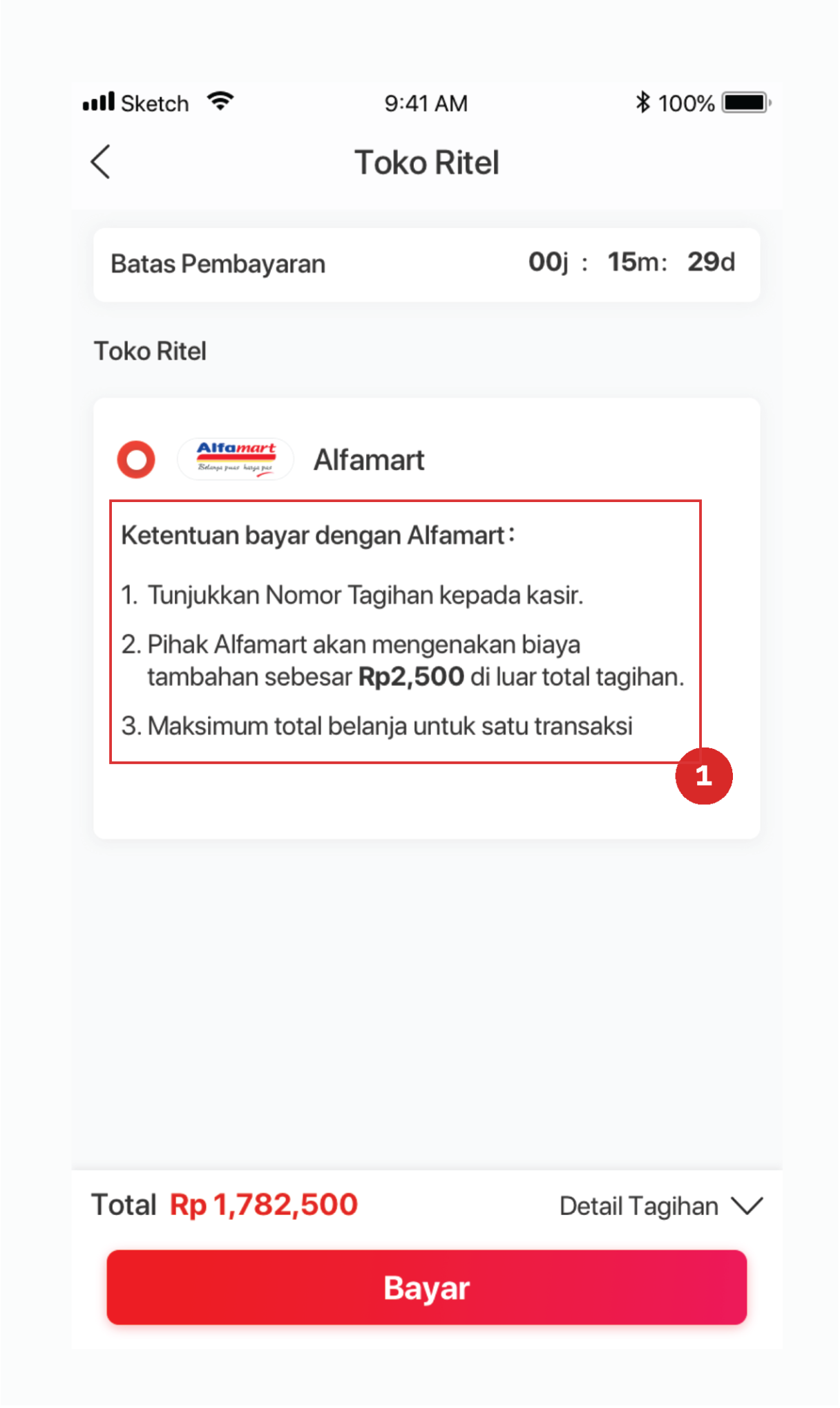
Usefulness and purpose :
this page same layout with Bank Transfer (Verifikasi Manual) and Virtual Account, for alfamart verifica- tion will be automaticly to be confirm if you paid in alfamart
1. Information about terms to pay with alfamart method
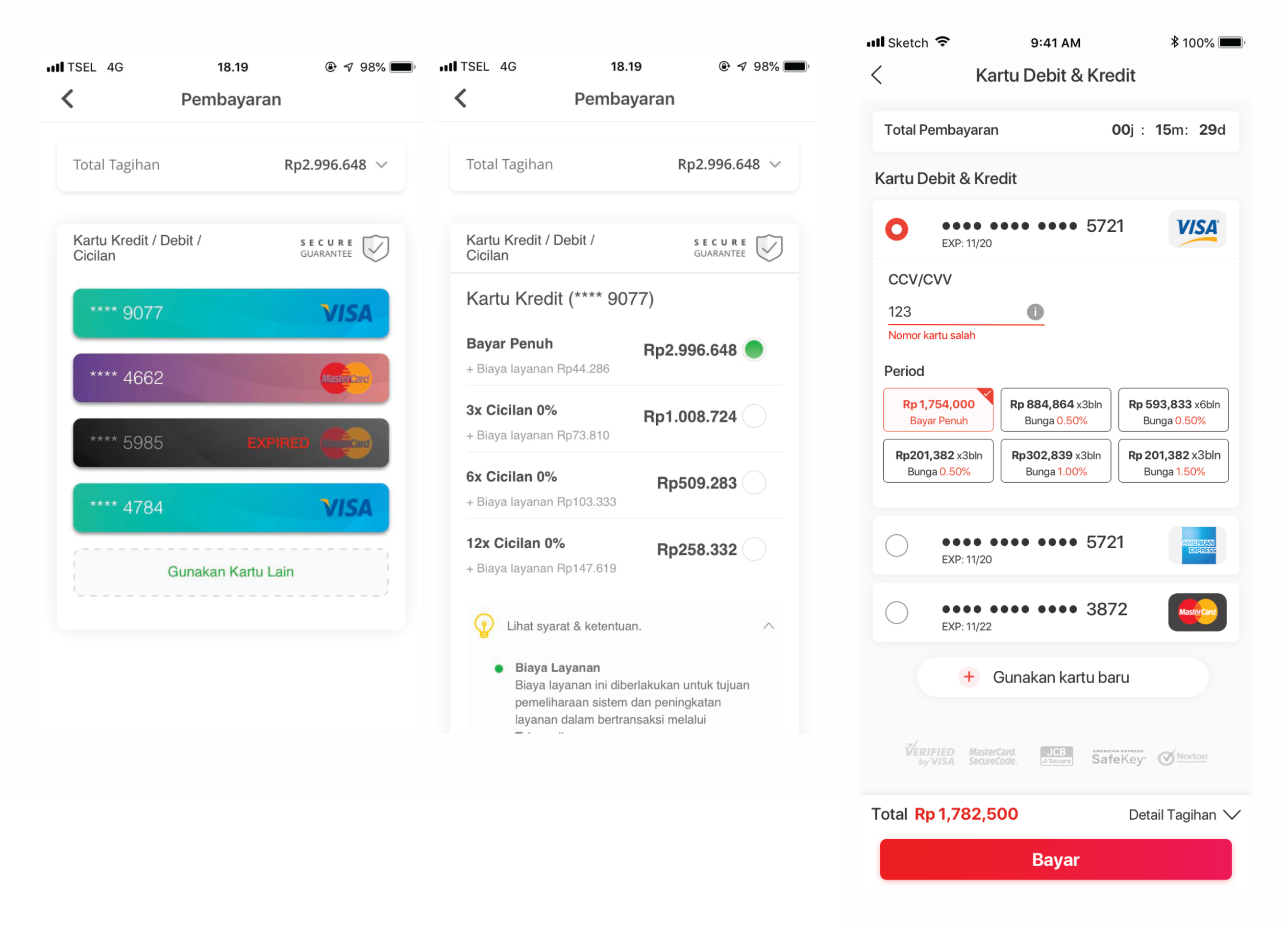
6. Credit/Debit Card
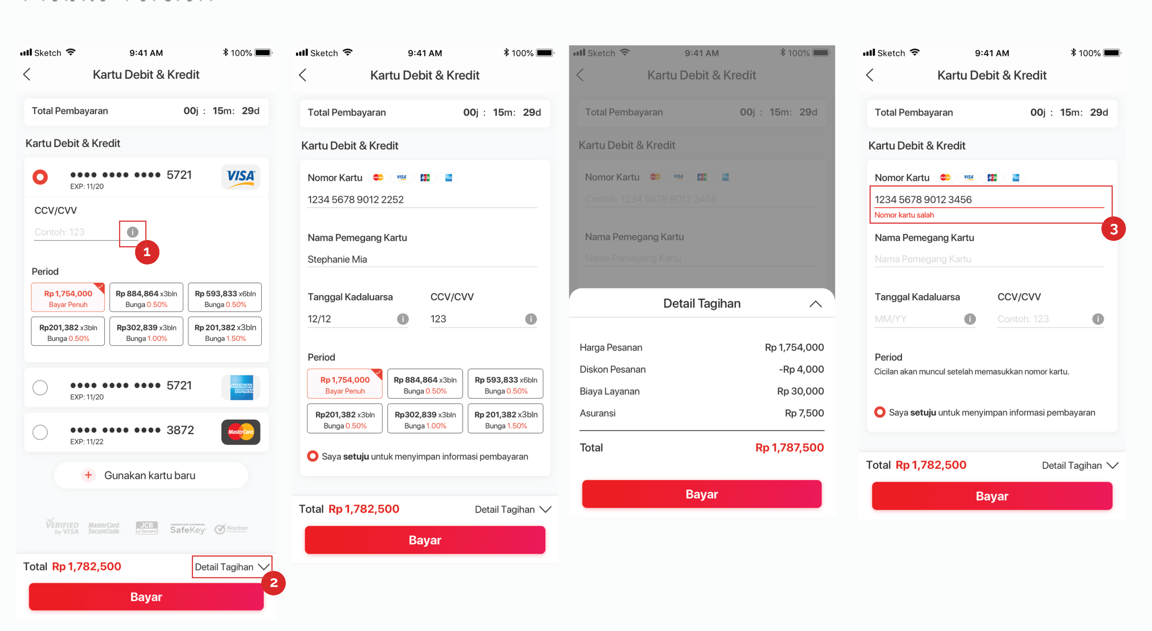
Usefulness and purpose :
1. this symbol for represent hint important information
2. will show the order & payment detail when user click ‘Detail Tagihan’ section we made a full page pop up because detail order its to many information must be show
3. alert if when customer wrong input number card is false
A/B Testing
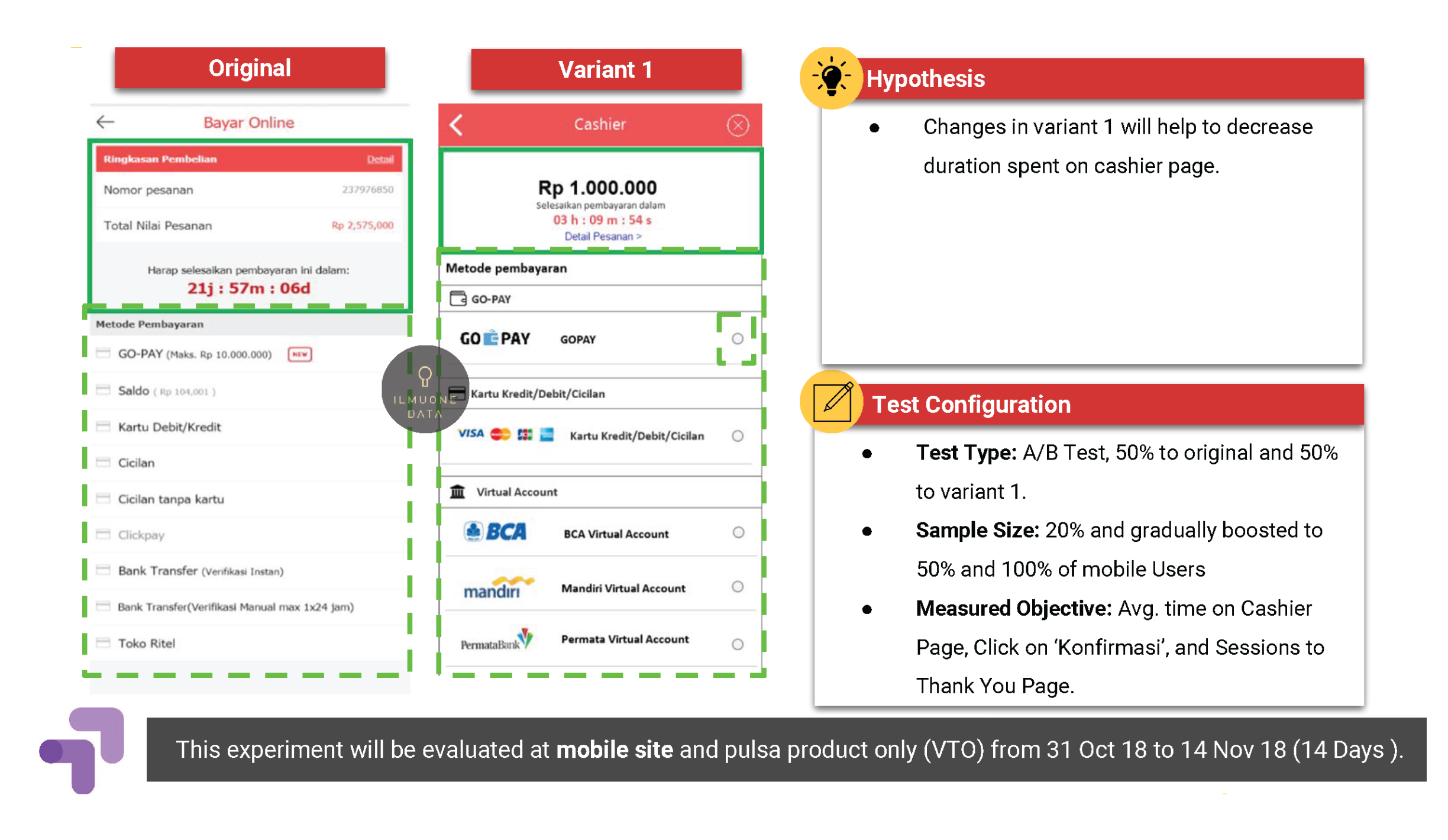
Element Changes Summary:
1. Centered payment summary
2. Snippet logo of each payment method
3. More visible and clickable payment method button
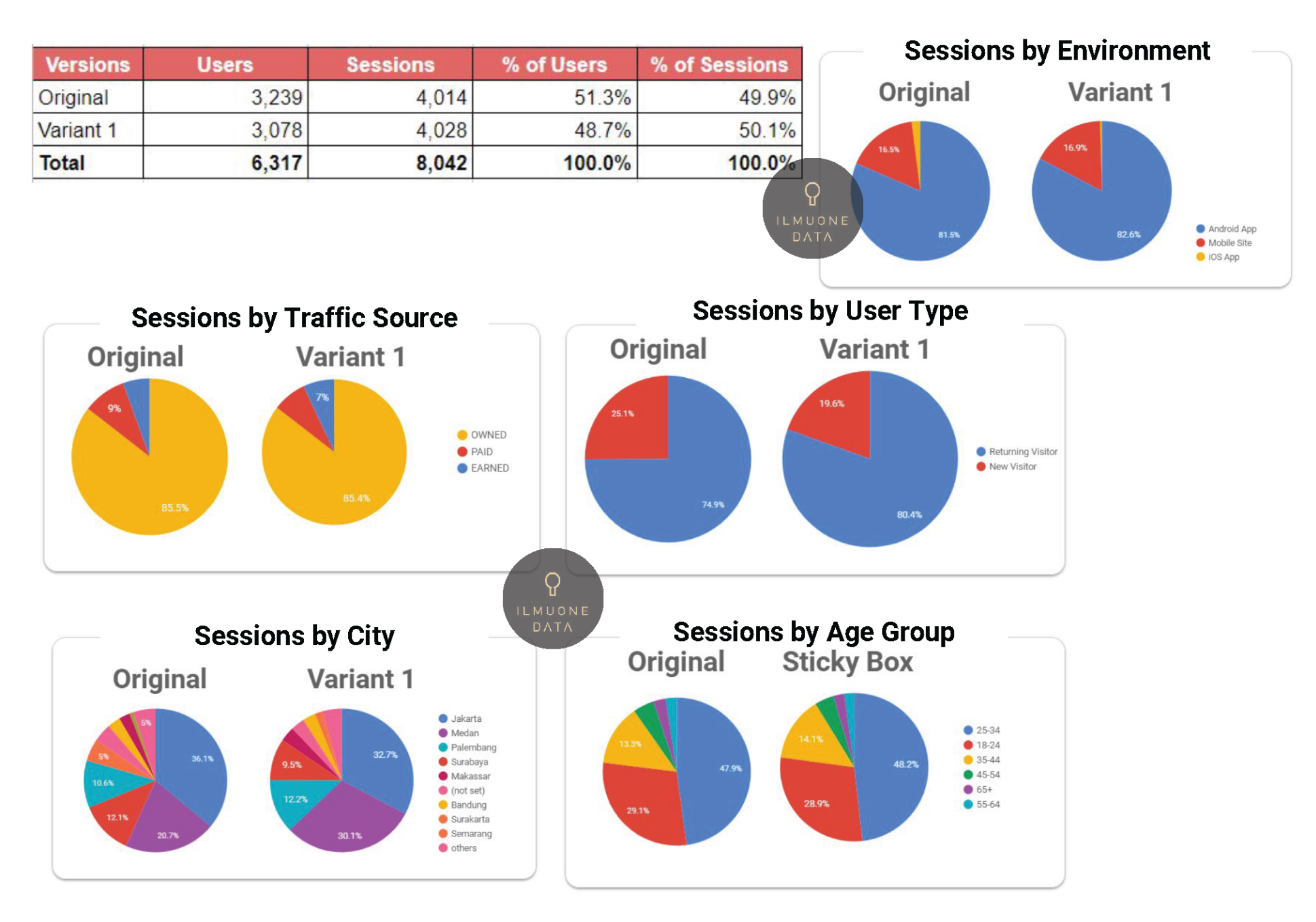
Experiment Audience Profile | Composition Based on Traffic Source & City
1. Users were distributed evenly across all variants and audience profile (i.e traffic source, city, User Type, Age Group, Environment), which means that the experiment results purely represent the effect of each variants to user engagement.
2. The charts shown beside confirm that sessions composition is spread evenly across all traffic sources (Paid, Owned and Earned), as well as cities, age group, returning/new users, and environment for all variants, hence, it is safe to infer that these factors would not affect the engagement metrics and any effect on the metrics will be caused by the experiment.
Metrics to Measure and Determine Winning Variant
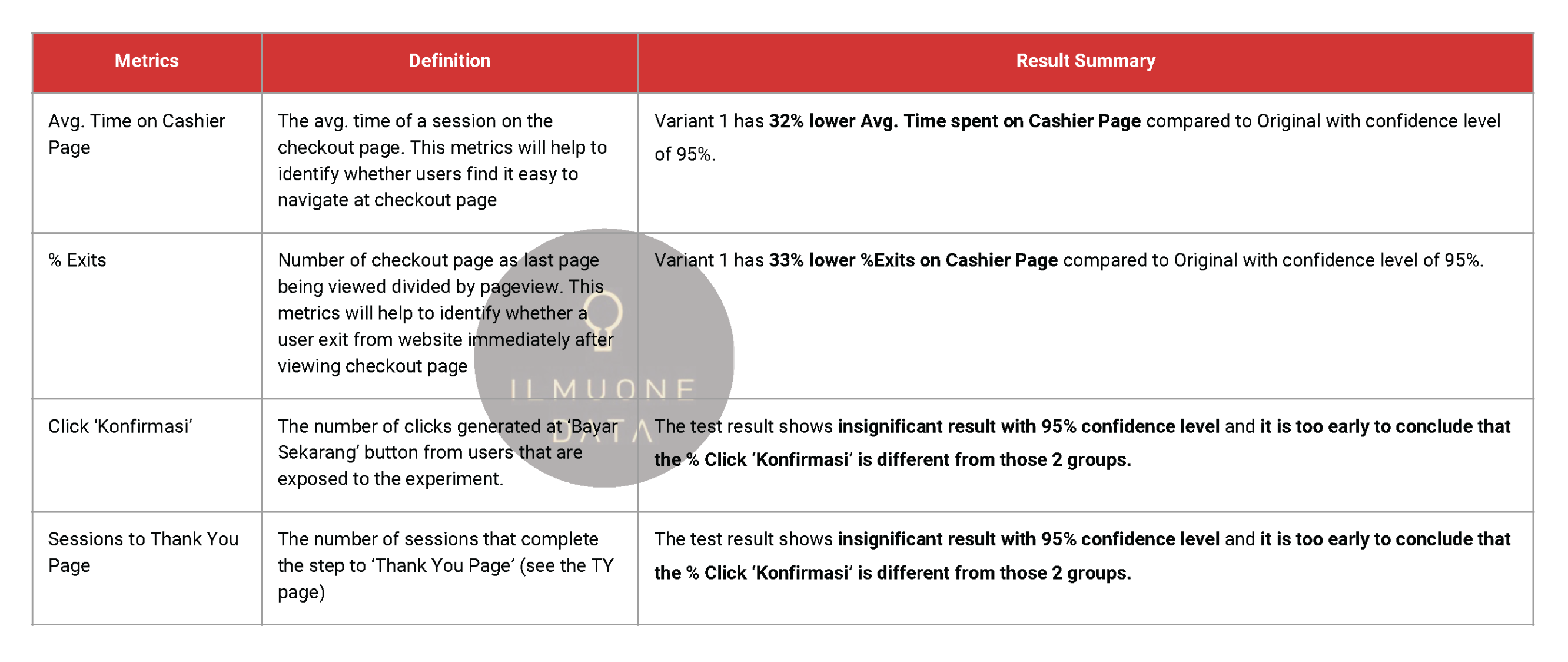
Avg. Time on Cashier Page
1. Variant 1 has 32% lower Avg. Time spent on Cashier Page compared to Original with confidence level of 95%.
2. It is much easier for users to use variant 1 of cashier page compared to original version
3. Looking at design / layout perspective, variant 1 has a more visual clickable button and smoother user interface, this could be the main reason why users are leaving the cashier page faster.
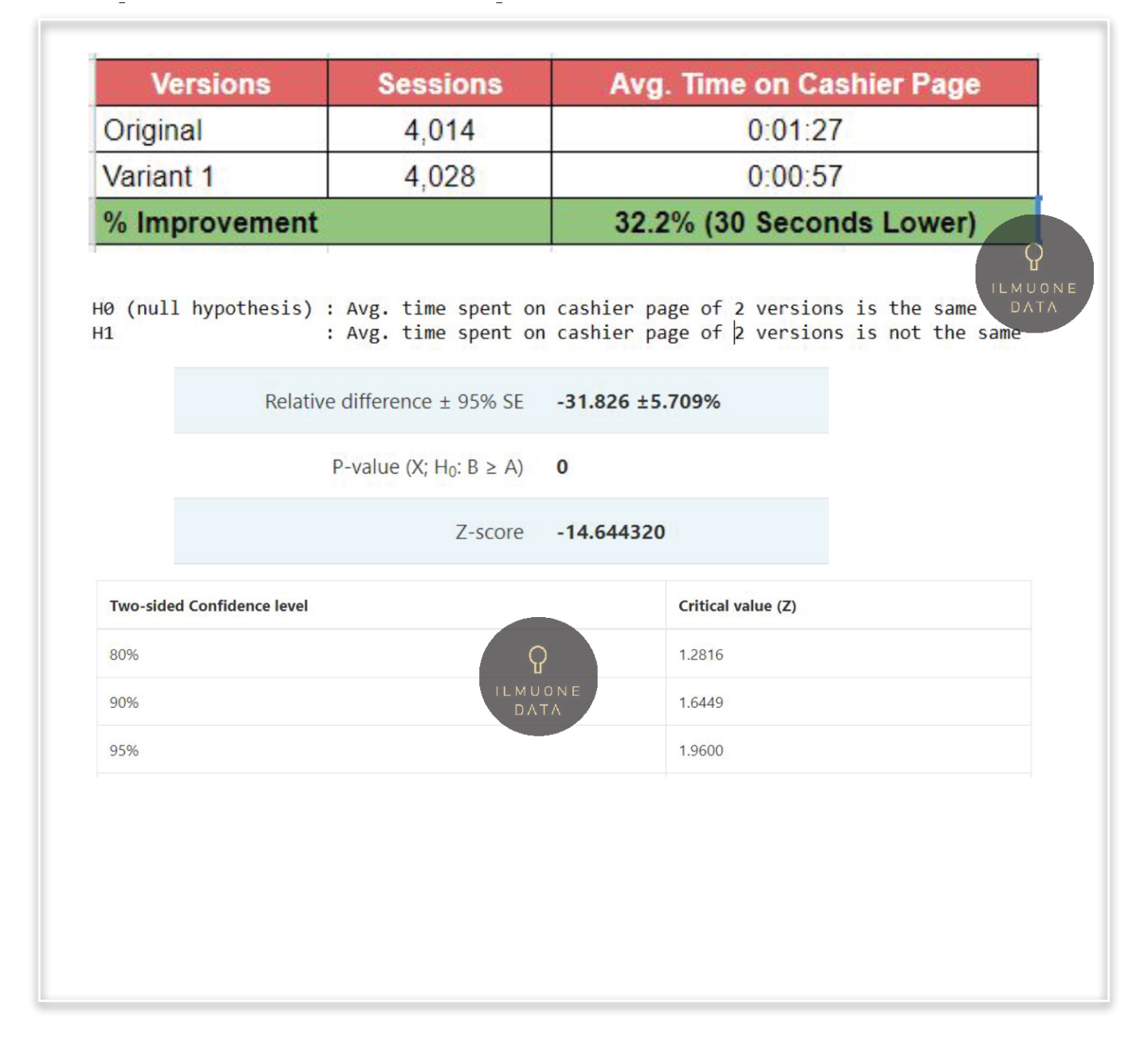
% Exits on Cashier Page
1. %Exits is (number of exits) / (number of pageviews) for the page or set of pages. It indicates how often users exit from that page or set of pages when they view the page(s).
2. Variant 1 has 33% lower %Exits on Cashier Page compared to Original with confidence level of 95%.
3. Combining this insight with the avg. time on page indicates users are likely to spent less time on cashier page but not leaving the website or app.
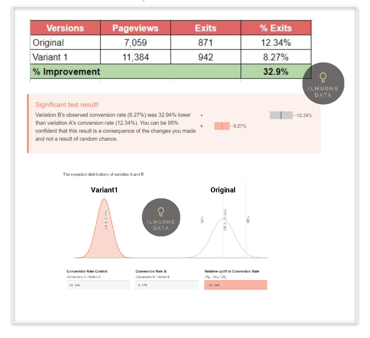
% Click ‘Konfirmasi’
1. Another metrics to measure is % Click ‘Konfirmasi’. Cashier page is located at the end of the funnel so we would expect high % Click ‘Konfirmasi’ as users who reached this page have high buying intention.
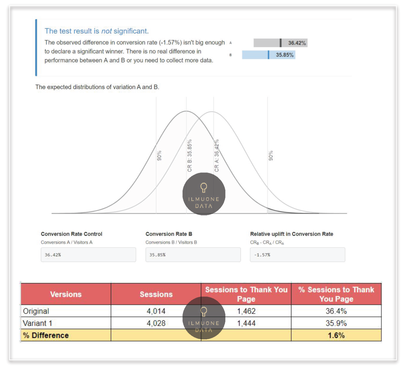
2. The test result shows insignificant result with 95% confidence level even though the % difference is quite big. But due to low sample size, it is too early to conclude that the % Click ‘Konfirmasi’ is different from those 2 groups.
3. Combining this and previous insight we can conclude this experiment has helped users to leave cashier page faster but didn’t trigger to have different % Click ‘Konfirmasi’.
4. From user journey perspective, this insights is align as cashier page located at the bottom funnel, there are many factors to drive higher % click ‘Konfirmasi’ button from upper funnel.
Sessions to Thank You Page
1. Another metrics to measure is Sessions to Thank you Page. Cashier page is located at the end of the funnel so we would expect high % Sessions To Thank You Page as users who reached this page have high buying intention.
2. The test result shows insignificant result with 95% confidence level even though the % difference is quite big. But due to low sample size, it is too early to make a conclusion.
3. Combining this and previous insight we can conclude this experiment has helped users to leave cashier page faster but didn’t trigger to have different sessions to thank you page.
Key Takeaways
Users that are exposed to ‘Variant 1’ cashier page are more likely to leave the cashier page faster but not leaving the website or app (less avg. time on page and %exits) with 95% confidence interval. However the difference is not significant for %Click ‘Konfirmasi’ and %Sessions to TY Page. This means, users find it easier to navigate by using ‘variant 1’ cashier page but to have different % success rate (click ‘konfirmasi’ or sessions to thank you page) will need more experiment.
Usability Testing (UX Research Method)
Background
Users are asked to complete tasks, typically while they are being observed by a researcher, to see where they encounter problems and experience confusion. If more people encounter similar problems, recommendations will be made to overcome these usability issues. we are to know how user wants with experience and behavior indonesian people
What we want to know?
1. Did it take you more time to find what you were looking for payment method that you needed on our payment page?
2. How easy to understand the information on our website?
3. How visually appealing is our website?
4. The text is clearly written and easy to read?
5. Overall, how well does our website meet your needs?
6. What is the most important feature you think we should add? 7. how user notice a navigation symbol, icon and many more? 8. How often do you shop on e-commerce?and JD.id?
People Personal Information
1. Behaviour and experience user to the ecommerce, especially JD.id
2. Job
3. Occupation
4. Age
Comparative Analysis

-Tokopedia
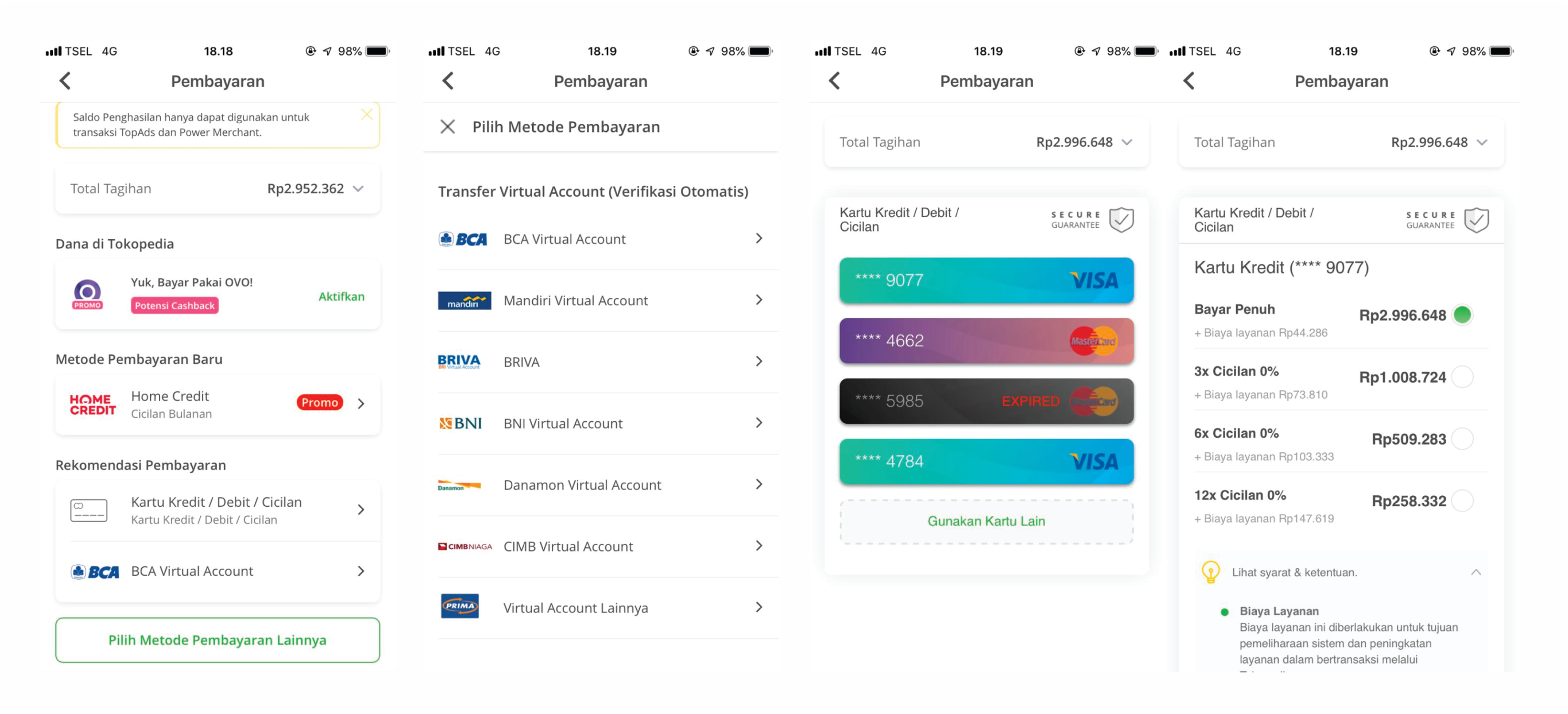
Tokopedia the one and only ecommerce in indonesia have layout to show all the bank, company, many more. but i think the total click and view much more than our current cashier but more informative
-Lazada
Lazada layout like our new cashier. and the step more informative
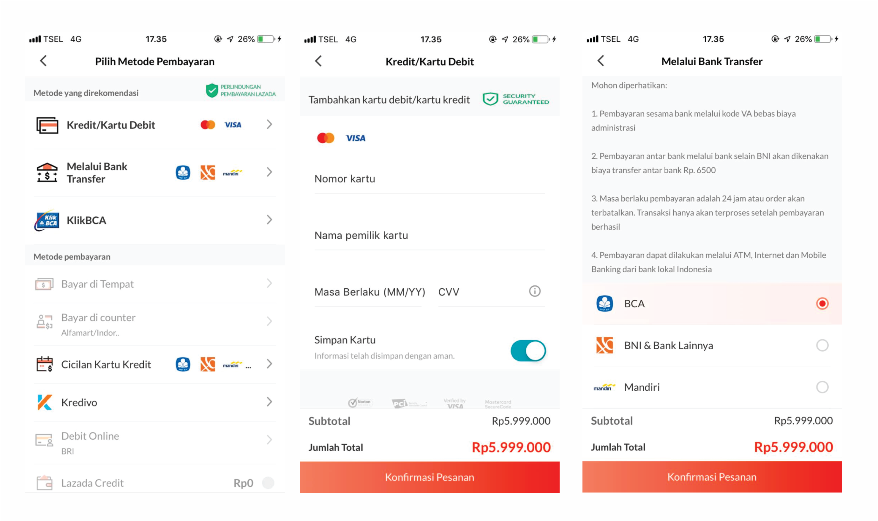
-Bukalapak
the last competitor is bukalapak, design similar like new cashier but more step to input data need move to the next page
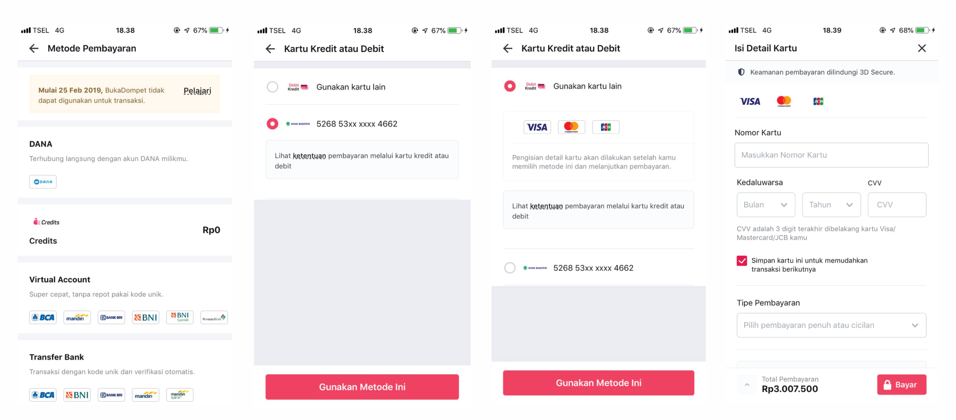
Comparative Analysis Summary
1. The current cashier have a layout similar like tokopedia payment method. show all the payment method and company we provided. we want to change layout similar like bukalapak but more informative and step will be easy to use.
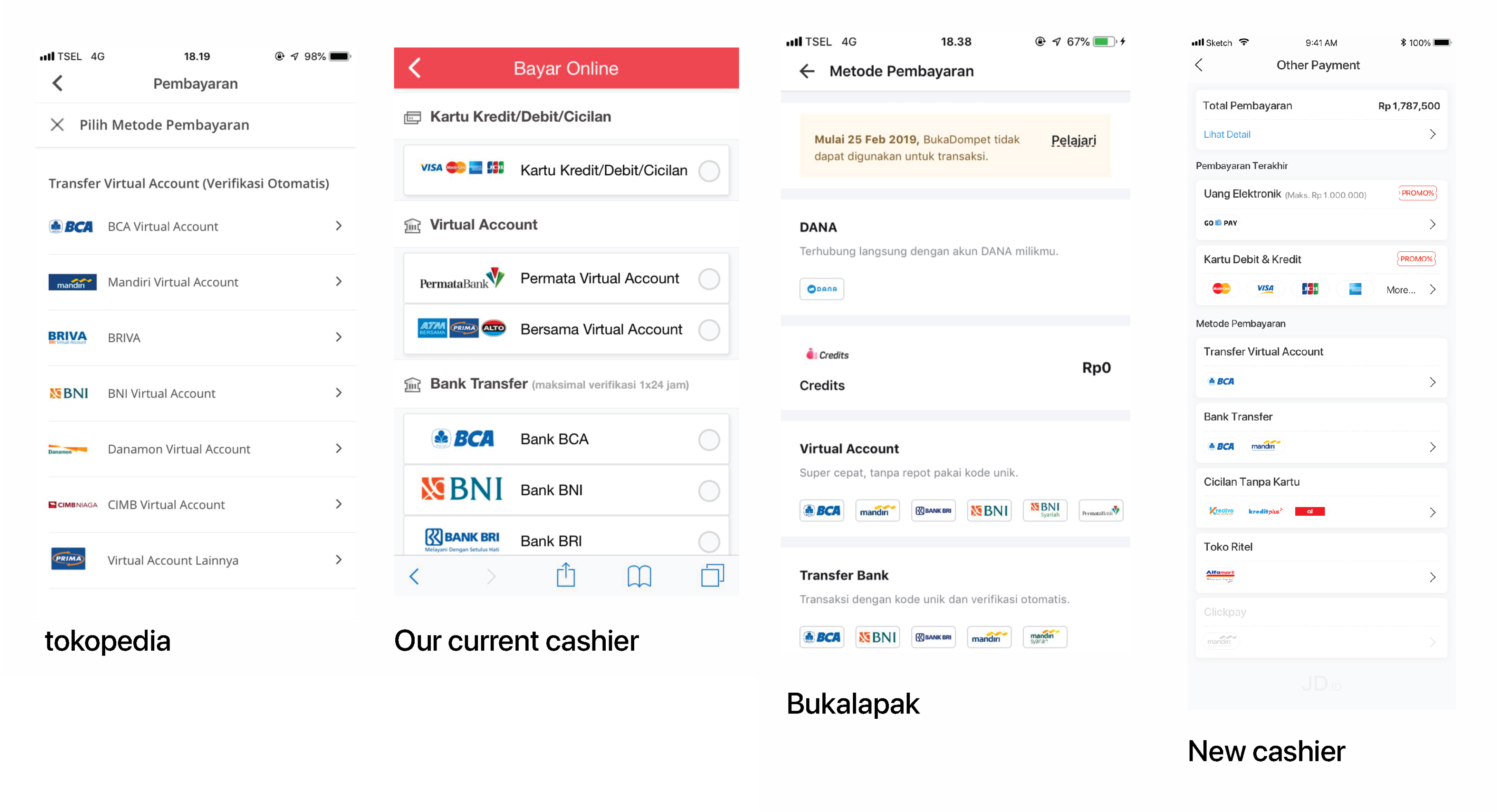
2. a new design in credit card page have a layout similar like tokopedia. but we have different values and designs more good than tokopedia doing.
Data Analysis
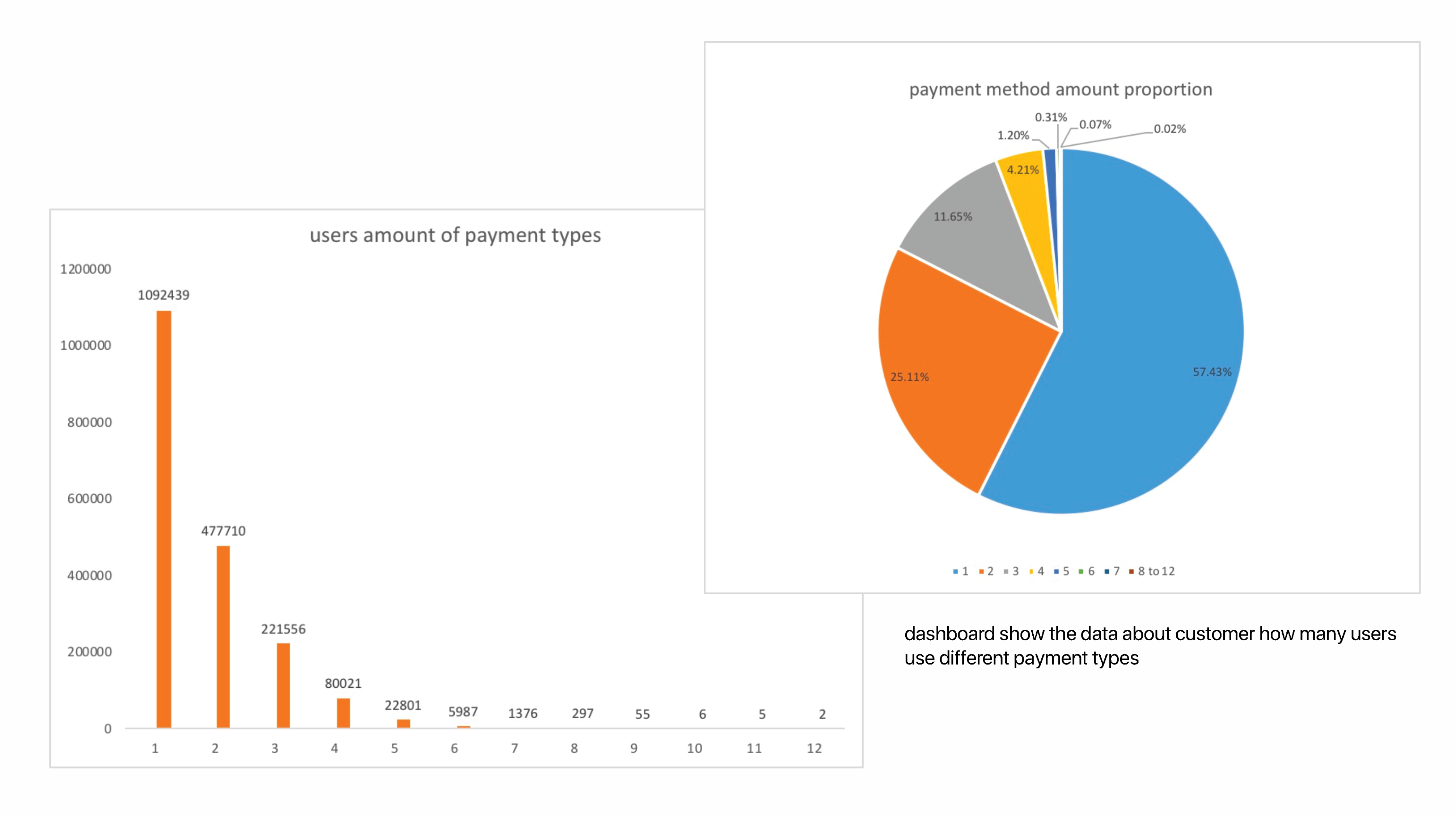
Data Analysis

Conclusion
This testing purpose is for find the good solution and the right transformation about revamp. we want to know how user wants, all user want a easy and friendly to use. we should be give to user a good interface and flow. no need faster flow if user not comfortable and and not provide information clearly. and the result from interview randomly user we found the right conclusion. revamp the new layout to be more consistent and more informative. and the new cashier designb have spesification for that
Weakness & Strength
Current Design
- Weakness
1. The current cashier to much letter make a user hard to find a payment method and provider that will be choice
2. the scroll is longer to get to the bottom and back again to top, if more payment method will be add new in JD the scroll wil
- Strength
1. if you are familiar with this cashier or smart users will be quick to make payments because it is done on one page only
2. show information on all payment methods and companies provided
New Design
- Weakness
1. payment will be slow due to moving steps especially if the connection is weak
2. user can’t notice all bank be provided because all bank will be hidden in first page
- Strength
1. shorten the scrolling page
2. category more well structured